 Your new post is loading...
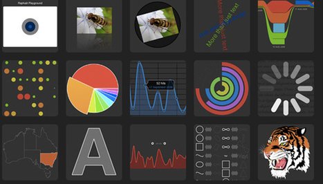
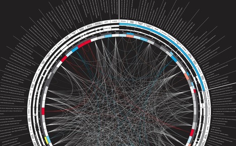
Robin Good: David McCandlees, the author of the book Information is Beautiful celebrates great data visualization and information design work through the Information is Beautiful Awards.
Together with a jury of experts like Brian Eno, Paola Antonelli, Maria Popova, Simon Rogers and Aziz Kami, he has curated a unique selection of 300 designs and a short list of finalists in the following categories: » Data visualization– A singular visualisation of data or information.» Infographic – Using multiple data visualisations in service to a theme or story » Interactive visualization – Any viz where you can dynamically filter or explore the data. » Data journalism – A combination of text and visualizations in a journalistic format. » Motion infographic – Moving and animated visualizations along a theme or story. » Tool or website – Online tools & apps to aid datavizzing. The selection itself is worth a tour of the site and of this initiative. Check: http://www.informationisbeautifulawards.com/ Longlist selection: http://www.informationisbeautifulawards.com/2012/07/our-longlist/ Shortlist selection: http://www.informationisbeautifulawards.com/2012/08/awardshortlist/
Via Robin Good, Dr. Stefan Gruenwald
Every picture tells a story, as they say, but sometimes it takes a clever combination of words and pictures to tell a story quickly, concisely and in an entertaining fashion. The best infographics may look like they were simple to create in Photoshop, but designing an effective piece of data visualization is usually anything but.
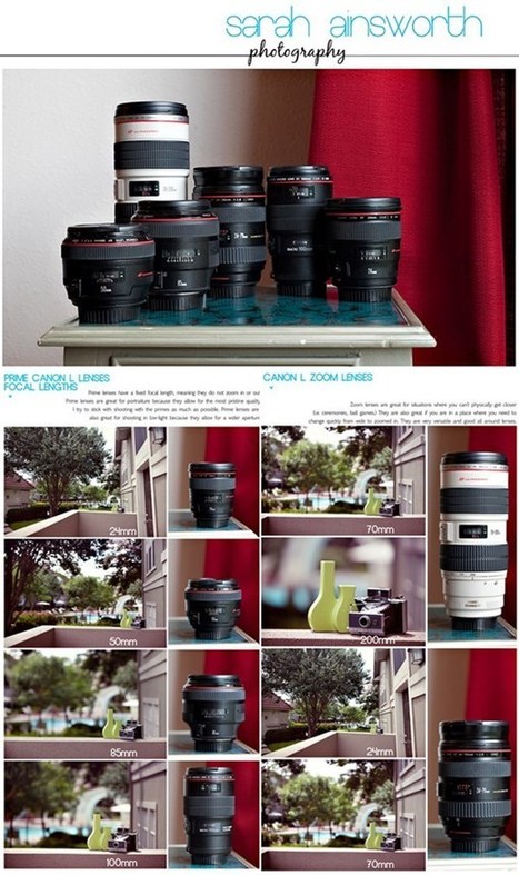
27 Photography Cheat Sheets and Infographics For Photographers. These things are so simple that doing a few clicks would provide you the results you want to achieve.
Vizalizer simplifies the creation, analysis and generation of data visualization through a Social Network that brings together publishers with colleagues and readers, to create content for its analysis and discussion, use in presentations and publications.
Via Baiba Svenca
A picture is worth a thousand words – based on this, infographics would carry hundreds of thousands of words, yet if you let a reader choose between a full-length 1000-word article and an infographic that needs a few scroll-downs, they’d probably...
Via Youyouk
I have decided to bring an article about HTML5 infographics to help you learn more about HTML5 and its impact.
Infographic on Making Awesome & Creative infographics with 10 best ways & tools to make infographic for best marketing guide online to convert emails into sales
Static Infographics and Motion Graphics are great, but Interactive Visualizations are where all the fun is. Another year has gone by, and we've polluted
Via Audrey Bardon, Goulu
Infographics have changed the way "information" is seen by today's generation. Its no more a scary charts and numbers but a pleasant mixture of text, images, charts, signs etc.
Via Peter Shanks
From simple charts to complex maps and infographics, Brian Suda's round-up of the best – and mostly free – tools has everything you need to bring your data to life... A common question is how to get started with data visualisations. Beyond following blogs, you need to practice – and to practice, you need to understand the tools available. In this article, get introduced to 20 different tools for creating visualisations...
Via Lauren Moss, Baiba Svenca
|
If you have been a digital or content marketer for some time, you know this problem only too well – there isn’t much free stuff when it comes to visuals or photographs for your precious content. And as you might be fully aware by now – you just can’t substitute having visuals with texts.
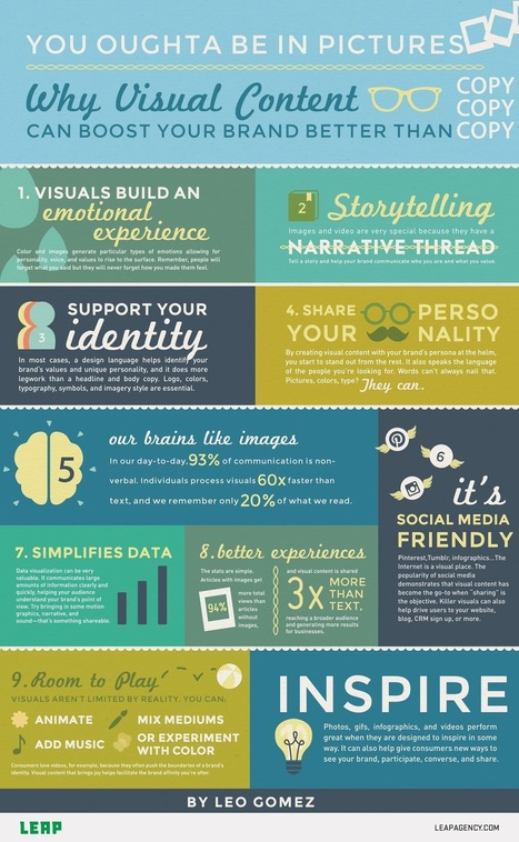
Visuals give your text – be it website content, blog, social media posts, e-papers, presentations and books, researches –a powerful reach that changes the way the content is received by your target audience. And that’s because the brain processes images faster than the written text – 60,000 times faster. Here’s a great infographic by Leo Gomez to demonstrate this fact visually.
5 infographics and free templates that will teach you how to easily create professional-looking infographics in PowerPoint.
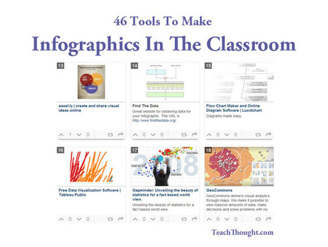
46 Tools To Make Infographics In The Classroom (Nice Collection! 46 Tools To Make #Infographics In The #Classroom http://t.co/za6ihjvy2g Useful for everyone!
Via Jon Samuelson
I love a good infographic! After all, knowledge is power and the visualization of data makes absorbing information all the easier. Well-designed infographics have a way of pulling me into a subject I’d normally never care to know about. As a designer I can attest to the crazy amount of time it takes to make a compelling, useful infographic. I have to say I knew about many of the great links, resources and tools I’ve linked to here on this post before but I dug deep and found some new and exciting infographic tools that I’m willing to bet you haven’t seen before. Items 1-5 under the Data Visualization Tools and Software category are sufficiently capable of arming even a novice designer with the ability to produce a powerful infographic (though I’m sure experts will find them handy as well). In short, if you love infographics, data visualization and information design as much as I do, you’re going to love this post. As always, leave me a comment with your thoughts and suggestions!
Communicating effectively in our era of information overload means moving beyond static words and numbers. Images and graphics carry meaning in a way that cuts through verbal clutter. That’s why infographics have become such powerful tools, used by companies large and small to communicate with employees, customers and the broader public. Traditionally, creating infographics has required the services of a skilled design professional and a sizable budget for expert time and talent. With a range of new web services, the cost and complexity of creating infographics has fallen dramatically. Infographics can be useful for explaining business processes and logistics, or for explaining the size, scope, scale or nuance of a project or service. Here are five of the best tools for putting together your own business infographics.
Via Lauren Moss
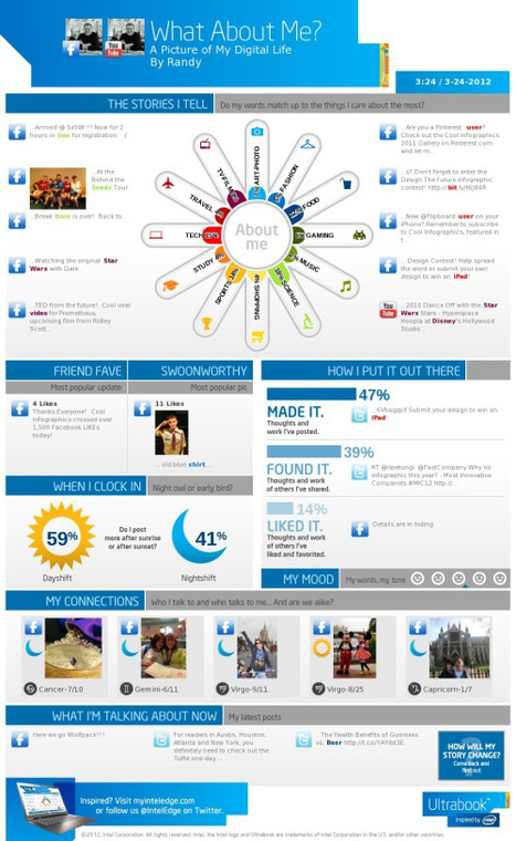
There are so many tools now available to help you make your own infographic, and this post shares information on ten tools that will help you visually represent data. For each tool a short description is provided as well as a visual. The tools discussed are: Visual.ly, Dipity, Easel.ly, Venngage, Infogr.am, Tableau Public, Photo Stats (for iPhone), What About Me? (create an infographic about your digital life), Gliffy, and Piktochart. Ten great tools that will allow you to create (or have your students create) infographics for this school year!
Via Beth Dichter, Brian Yanish - MarketingHits.com, roberto toppi, Marita Roebkes http://xeeme.com/MaritaR, Dubie Bacino
2012 has certainly been an eventful year, with everything from elections, to olympics, to scientific breakthroughs, to major weather events. To help review some of the things that happened, here are 20 of the best static infographics from the year. 1. There were several space related events this year. NASA’s Curiosity rover landed on mars, and successfully began collecting data. As this graphic by billowyclouds shows, the scariest part was a terrifying 7 minute landing.
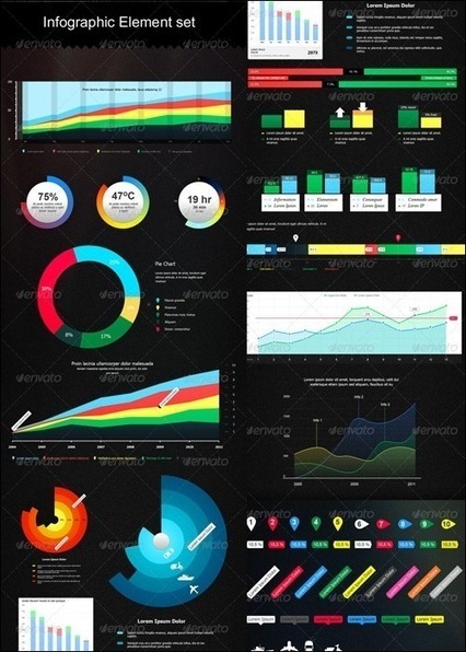
Infograpics have become so popular these days and as a result more and more high quality infographic graphics and entire design kits are made available to help designers.
The world wide web has become significantly more worldwide over the past two decades. By 2010, more than 2 billion people--or about one-third of the global population--had access to the internet, up from something like .05 percent in 1990, and less than 10 percent of users worldwide now reside in the U.S.
As seen in this visualization two big trends are evident: the geographical diversification of the web, and China's sudden expansion and global dominance as an internet presence...
Further information explaining these trends comes from Google's public data tool. Take a look at the additional charts at the link--the first shows the relative proportion of internet users by country, and the second shows each country's total number of users.
Via Lauren Moss
Ready to create amazing infographics to drive links, social shares, and traffic back to your website? The following are over 20 resources for creating
Learn how to Create Data Visualization Infographics with Top 10 free awesome Visuals creation tools and Promote information graphics for free.
|


![How The Internet Has Spread Around The World [Infographic] | Best | Scoop.it](https://img.scoop.it/UQ7EvFapsviLNLtr0Z0e3zl72eJkfbmt4t8yenImKBVvK0kTmF0xjctABnaLJIm9)


