

A guide to using the techniques of data mining and data journalism to create compelling, original content in the form of data visualizations.
Get Started for FREE
Sign up with Facebook Sign up with X
I don't have a Facebook or a X account


 Your new post is loading...
 Your new post is loading...
Your new post is loading...
A guide to using the techniques of data mining and data journalism to create compelling, original content in the form of data visualizations. 
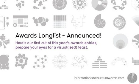
Robin Good: David McCandlees, the author of the book Information is Beautiful celebrates great data visualization and information design work through the Information is Beautiful Awards.
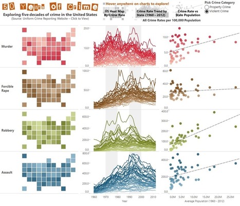
» Data visualization– A singular visualisation of data or information.» Infographic – Using multiple data visualisations in service to a theme or story
» Interactive visualization – Any viz where you can dynamically filter or explore the data.
» Data journalism – A combination of text and visualizations in a journalistic format.
» Motion infographic – Moving and animated visualizations along a theme or story.
» Tool or website – Online tools & apps to aid datavizzing.
The selection itself is worth a tour of the site and of this initiative.
Check: http://www.informationisbeautifulawards.com/
Longlist selection: http://www.informationisbeautifulawards.com/2012/07/our-longlist/
Shortlist selection: http://www.informationisbeautifulawards.com/2012/08/awardshortlist/
Via Robin Good, luiy
|
A new site called Dadaviz aims to make quality visualizations just as social and discoverable on the web as video or music. Where do you go on the web if you want to see great data visualizations? With a few exceptions, like Reddit's Data Is Beautiful subforum, there is no one-stop destination for quality data viz on the web. But Dadaviz aims to change all of that. Aiming to be a portal for the best visualization content on the web, it also want to teach big advertisers to harness the power of data to sell their brands... Via Lauren Moss
Published on Nov 18, 2012 by TEDEducation
|


Cómo contar historias con números..How to Tell Stories with Numbers | @scoopit via @jimsignorelli http://sco.lt/...
añada su visión ...
#BigData #Numbers #Analytics #ContentMarketing