

Research and publish the best content.
Get Started for FREE
Sign up with Facebook Sign up with X
I don't have a Facebook or a X account
Already have an account: Login

Didactics and Technology in Education
107.6K views |
+0 today

Almost "everything" about new approaches in Education
Curated by
Rui Guimarães Lima
 Your new post is loading...
 Your new post is loading...
Your new post is loading...
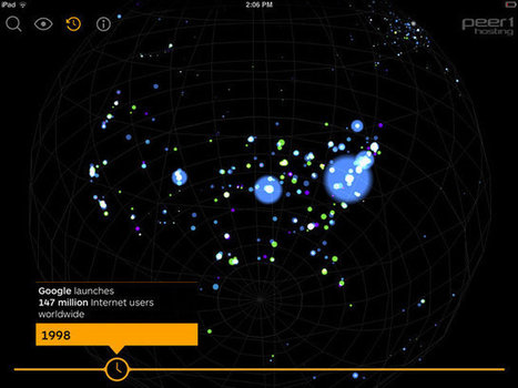
Mankind loves making maps, and the world wide web, densely interconnected and phenomenally complex, always makes for a nice visual. Typically these take the form of neon blobs floating against black backgrounds, like frames captured from old Winamp plug-ins, and while they’re always nice to look at, they don’t always do much in the way of helping us understand the massive global network we traverse every day. This latest effort, however, is a little different. Called simply Map of the Internet, it’s as informative as it is beautiful. The map, which takes the form of a free app for Android and iOS, features 22,961 of the Internet’s biggest nodes--not individual websites, but the ISPs, universities, and other places that host them--joined by some 50,000 discrete connections. The app gives you two ways of surveying it all: geographically, on a globe, or by size, which rearranges the nodes into a loose column of points. Both views are interactive; instead of showing the Internet as a static neon blob, the app lets you explore the neon blob in the round, with all the familiar multitouch gestures. It may not look like the Google Maps app, but it instantly feels like it, which makes exploring the underbelly of the web all the easier... Via Lauren Moss 
|

Autonomous vehicles -- fully or partially -- will rely on a large variety of data types. And guess who is best positioned to take advantage of this enormous new business ?
|


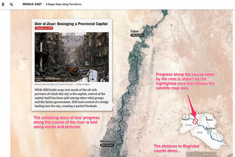
The above examples describe a wide range of geographical and geotemporal storytelling models, often based around quite simple data files containing information about individual events. Many of the tools make a strong use of image files as pat of the display. it may be interesting to complete a more detailed review that describes the exact data models used by each of the techniques, with a view to identifying a generic data model that could be used by each of the different models, or transformed into the distinct data representations supported by each of the separate tools.
- See more at: http://schoolofdata.org/2014/08/25/seven-ways-to-create-a-storymap/#sthash.tWi68hgm.dpuf