


An experimental tool to understand the world.
Get Started for FREE
Sign up with Facebook Sign up with X
I don't have a Facebook or a X account


 Your new post is loading...
 Your new post is loading...
Your new post is loading...

These cluster maps give us a two-dimensional look at the complex arguments Americans posted on the topic of net neutrality. One theme in the comments had to do with the American dream. Via luiy 

luiy's curator insight,
August 19, 2014 5:32 PM
How To Read This Cluster Map
- Similar nodes typically cluster together and clusters are grouped by color - Each node represents a news story; a node sized by degree represents number of connections (i.e., similarity) to other nodes - Connections represent similar language used across nodes - A node bridging two clusters can indicate a story that synthesizes multiple topics
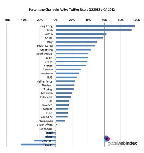
The most detailed study of social media ever conducted Via janlgordon, catspyjamasnz, Elena Elliniadou

Gaurav Pandey's curator insight,
February 16, 2013 8:34 PM
Great study on Twitter! Here's another link to help you better engage on this platform https://business.twitter.com/en/basics/best-practices/ Also, download their Twitter guide for small businesses, the link's on the top right hand side of the page. The guide comes from Twitter and is very helpful if you want to use Twitter to spread the word on your business. And finally, thank you Gust MEES (http://www.scoop.it/t/social-media-and-its-influence) for sharing some really meaningful stuff! Do follow the guy for some great tips and insights. Cheers! And if you like if, please share 'coz social is all about sharing and caring :) |
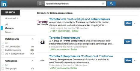
Getting ideal clients to visit your LinkedIn profile can be a crucial first step in your online sales funnel if you follow a few guidelines for success. Via Anthony Beal, THE OFFICIAL ANDREASCY

Anthony Beal's curator insight,
November 27, 2014 11:27 AM
These tips can be useful for learners looking to showcase their talents
Europeanna has been studying the "value of Pinterest for cultural heritage institutions" By "taking content from five Europeana partners and presenting this content outside the constraints of the portal and institutional websites, Pinterest provided new visibility and interaction with collections that might otherwise have remained unseen" This project not only boosted visitor engagement with the content, it claims to have attracted "good quality visitors" spending longer on the site. I think this clearly signposts that Museums, Galleries, or indeed any cultural organisations can draw benefits from the Social Web by sharing openly in an online space with other institutions and organisations.
I think this project may be offering some answers to the question that is often asked - "why is no one coming to our web-site?" I think there are also some clear messages here for providers of educational cultural content. Via theo kuechel
Great post by Kim Garst, Twitter can be a very powerful tool to build your business if you use it wisely.
Intro:
The purpose of Twitter and all social media, is not to make money, but to brand YOU and your business and build relationships with potential and existing customers. The money will follow if you put your customers FIRST.
**Mix your "business" talk with "life" talk
Excerpt::
"Twitter challenges personal brands to reach out to their audience differently than they would in traditional marketing and/or social media platforms."
Here are some highlights that caught my attention:
**The resource sharing tweet - Find a great article or a resource that you know your target audience could benefit from
**The quotable tweet - This one speaks for itself
**Tip of the Day Tweet - great way to provide relevant content to your target audience by providing them a valuable piece of info that they can use either personally or profesionally. This also builds vlaue for you as an expert within your niche.
Selected by Jan Gordon covering "Content Curation, Social Business and Beyond"
Read full article here: [http://bit.ly/NPTuDT] Via janlgordon, Tuba Angay-Crowder
|


I think this is an interesting representation to show how the ability to have access to news and internet is the new most important thing to have to get word out. Now if you can speak English and have a computer with internet access you can.
This map allows people to understand the flow of news from around the world. We can use it to see where and what is happening and chart it to connect trends for example Syria and France are large because of the recent happenings with terrorists and terror attacks.
Intro