Within its limits, SNA can be applied to identify individuals or organizations within a network, generate new leads and simulate flows of information or money throughout a network.
Get Started for FREE
Sign up with Facebook Sign up with X
I don't have a Facebook or a X account


|
Scooped by
luiy
onto e-Xploration |
Within its limits, SNA can be applied to identify individuals or organizations within a network, generate new leads and simulate flows of information or money throughout a network.

 Your new post is loading...
 Your new post is loading...
Your new post is loading...
luiy's insight:
Beginning with the origins, Oycib means in Mayan language "the place of honey". In this projet, Oycib is an e-Research infrastructure for the Collective Intelligence Analysis.
With Oycib infrastructure we propose an analysis model, based in the digital practices and collaboration profiles for the development of Social Learning and the Context Awareness in the Collective Intelligence process.
The infrastructure design and the profiles proposed here, are based on historical studies about social organization glyphs in Mayan culture made by Montgomery (2002) and Calvin (2012).
Initially we worked with four collaboration profiles: the "Itzaat", the "Pitziil", the "Ayuxul" and the "Sajal" (profiles), but we can find others depending of the organization context. Thus, it's important to mention that each profile is found based on the e-Xploración model and they are the qualitative and quantitative interpretation of the collaborative practices. In this way, we propose methods based on Social Network Analysis for the learning and knowledge management.
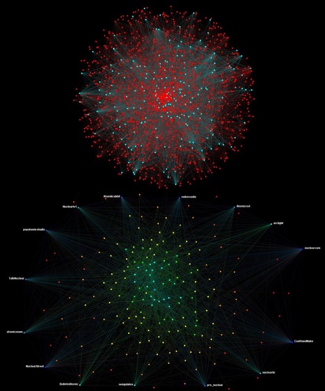
Thus, the network in Oycib is called "Kaan" (sky or network in Mayan Lenguage). In the "Kaan" we present the visualization of the subjects and objects, such as persons, forums, blogs, files, groups and all the interactions among them. Additionally, each profile and their interactions is presented.
... you can interact with "Kaan" here.

Woodcut illustration from an edition of 1763 (28th year of the Qianlong reign period of the Qing dynasty), showing the paths of the channels and distribution of the acu-moxa locations on the face and neck. The lines represent the stomach channel of foot yangming, the gall bladder channel of foot shaoyang, the lung channel of hand taiyin, the kidney channel of foot shaoyin, the small intestine channel of hand taiyang, the large intestine channel of hand yangming and renmai (the Director Vessel, also translated as Conception Vessel). For full list of point names, see 'Lettering'. N.B. This image is closely similar to L0034707, a chart of acu-moxa locations on the front of the head and neck dating to the Ming period (1368-1644). It was not, however, executed by the same hand.
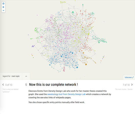
Manylinesmade by the médialab
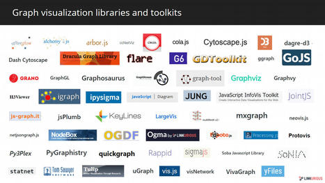
This post presents the ecosystem of graph visualization. Read on to find the full list of graph visualization software and graph visualization libraries.
luiy's insight:
The third layer of graph technology that we discuss in this article is the front-end layer, the graph visualization one. The visualization of information has been the support of many types of analysis, including Social Network Analysis. For decades, visual representations have helped researchers, analysts and enterprises derive insights from their data. Visualization tools represent an important bridge between graph data and analysts. It helps surface information and insights leading to the understanding of a situation, or the solving of a problem. While it’s easy to read and comprehend non-graph data in a tabular format such as a spreadsheet, you will probably miss valuable information if you try to analyze connected data the same way. Representing connected data in tables is not intuitive and often hides the connections in which lies the value. Graph visualization tools turn connected data into graphical network representations that takes advantage of the human brain proficiency to recognize visual patterns and more pattern variations.
Jonathan Albright, directeur de recherche au Tow Center for Digital Journalism, et data journaliste, a plongé dans les entrailles de YouTube pour mener l'enquête. En partant du mot-clé « crisis actor », en référence à la théorie du complot née après la tuerie de Parkland, il a abouti, via l’outil de recommandation de YouTube, à un réseau de 8 842 vidéos dont la majorité recèlent une théorie conspirationniste, et qui cumulent au total 4 milliards de vues. Sa conclusion ? Une profonde inquiétude, alors que plusieurs chercheurs ont déjà mis en évidence les effets pervers des algorithmes de recommandation de la plateforme, qui augmentent l'exposition de l’internaute à des contenus de plus en plus radicaux.
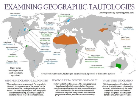
WHAT ARE GEOGRAPHICAL TAUTOLOGIES? When a place name is redundant. For example, in Spanish, Los Angeles means “The Angels”, so the baseball team The Los Angeles Angels actually means “The The Angels Angels”. The Gobi means desert in English. Therefore Gobi Desert translates to “Desert Desert” The infographic below shows the same thing, but with geographical locations instead of sports teams compared. HOW DO THESE TAUTOLOGIES COME ABOUT? History and different languages. The main geographic tautologies in English occurred when European colonizers or explorers combined a geographical term with a local word for the area. Often these would coincide, as they were being named after the same geographical feature, and that causes redundancy. WHAT’S IN THIS INFOGRAPHIC? With the exception of Pendleton Hill, Connecticut (which was too interesting to resist), included are only the major areas most people have heard of. Orange designates deserts, green denotes land, and blue is for water.

Think of LUNA as not just page after page of thumbnails, but as a dynamic space for working with digital content. Simple Keyword searching is a common way to search for content. Advanced Search can help you find specific items within certain parameters.
But what if you don't know what to search for? How can you enter a keyword if you don't have one? Try LUNA's browse facet categories feature. Browsing facets presents all the data of a collection in 4 categories: Who, What, When, and Where. Facets are also presented so you'll immediately know what kind of content is in a collection. Users can view individual images in the Detail View or multiple images in the LUNA Workspace. And of course there's still the ability to browse through pages of thumbnails but now you can customize your view selecting the number of thumbnails per page and their size. You can also choose to go full screen and eliminate your browser's navigation tools. Just use the forward and back feature on virtually every page of LUNA:

Explore this interactive visualization about the world of visualization itself - see charts arranged by popularity and trends in this collaboration between Google News Lab and Adioma

Explore the entire Paradise Papers dataset for yourself as a Neo4j Desktop package, now available for download from the Pulitzer Prize-winning ICIJ.

This interactive geoengineering map, prepared by ETC Group and the Heinrich Boell Foundation, is an attempt to shed light on the worldwide state of geoengineering by showing the scope of research and experimentation. There is no complete record of weather and climate control projects so this map is necessarily partial. It builds on an earlier map of Earth Systems Experimentation published in 2012. That original map documented almost 300 projects and experiments related to the field of geoengineering. Five years later over 800 such projects can be identified. These include projects in Carbon Capture, Solar Radiation Management, Weather Modification and other approaches.
For more information and background on geoengineering and its ecological, economic, social and justice implications see geoengineeringmonitor.org
The film follows the story of programming prodigy and information activist Aaron Swartz. From Swartz's help in the development of the basic internet protocol RSS to his co-founding of Reddit, his fingerprints are all over the internet. But it was Swartz's groundbreaking work in social justice and political organizing combined with his aggressive approach to information access that ensnared him in a two-year legal nightmare. It was a battle that ended with the taking of his own life at the age of 26. Aaron's story touched a nerve with people far beyond the online communities in which he was a celebrity. This film is a personal story about what we lose when we are tone deaf about technology and its relationship to our civil liberties.

Network Science

"Topogram"
|
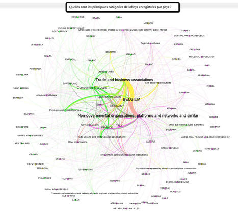
Dans un souci de transparence, Bruxelles a décidé de mettre en place un recensement des lobbies européens. La démarche reste toutefois au stade embryonnaire, mais une analyse des informations par des techniques de data visualisation révèle quelques points intéressants. Cela fait plusieurs années que la problématique des lobbies pèse comme une épée de Damoclès sur la réputation de l’Union Européenne. C’est que le lobbyiste a mauvaise presse, en France particulièrement mais en Europe en général. Beaucoup en conservent une vision fantasmée et stéréotypée. En réalité, celui-ci couvre une réalité à géométrie très variable. L’activité de lobbying couvre autant les lobbyistes « pur jus » issus de cabinets que les multinationales, les ONG, les cabinets d’avocat ou encore les institutions religieuses.
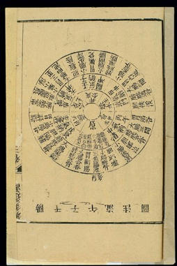
Woodcut illustration from a volume dated 1817 (22nd year of the Jiaqing reign period of the Qing dynasty). It consists of a circular diagram, showing the gan zi wu time cycle in the acu-moxa locations of the yang channels, i.e. the sanjiao (Triple Burner) channel of hand shaoyang, the large intestine channel of hand yangming, the bladder channel of foot taiyang, the stomach channel of foot yangming and the gall bladder channel of foot shaoyang.
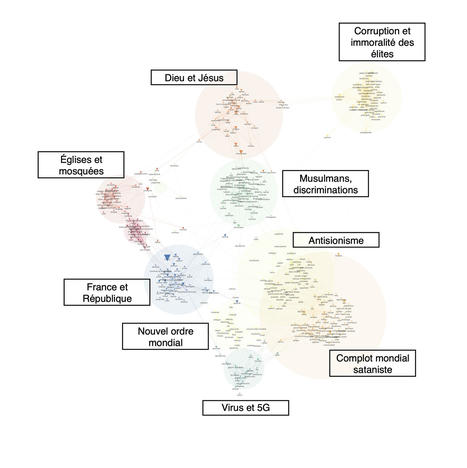
Dans le cadre du 30e rapport annuel de la Commission nationale consultative des droits de l’homme (CNCDH) sur le racisme, l’antisémitisme et la xénophobie, le médialab a entrepris un projet collectif proposant de cartographier les discours antisémites sur YouTube. Le rapport de la CNCDH, publié le 8 juillet 2021, fait état d’une empreinte antisémite faible mais non négligeable malgré le « nettoyage » réalisé en amont par la plateforme. Pour observer ce phénomène, cette enquête propose en premier lieu de cartographier l’espace francophone des principales chaînes d’information et d’actualité sur YouTube. Construit à partir d’une analyse quantitative des principales chaînes réunies sous l’étiquette Actualité et politique et d’une curation manuelle pour extraire les principales chaînes actives en 2020, ce corpus contient 628 chaînes. À partir des vidéos de chacune d’elles, nous avons extrait plus de 2 millions de commentaires postés par les internautes. La cartographie ci-dessous représente cette galaxie qui fait très clairement apparaître les principaux territoires informationnels de YouTube.

From
buff

The writer who invented ‘cyberspace’ – and possibly the most influential living sci-fi author – on the challenges of keeping up with a reality even stranger than fiction
Via Andrea Graziano
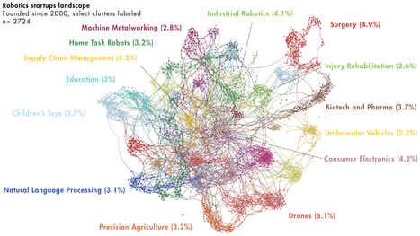
This is a network map of over 2700 robotics companies founded since 2000. This post is based on a talk Will Weisman, Executive Director of Summits at Singularity University, gave at the SU Global Summit where he used Quid to visualize the evolution of the robotics startup landscape during his introduction to exponential technologies.

The protection of the Intangible Cultural Heritage of UNESCO is ensured by a complex network of actors: institutions, associations, groups and individuals. The goal of this project is to understand which are the main actors in France and monitor over time the interactions between them. Web mapping has been identified as the most suitable methodology for this analysis. This method relies on the underlying idea that hyperlinks between web sites can be used as representations of social connections.
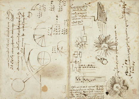
For hundreds of years, the huge, secretive collection of manuscripts remained mostly unseen by all but the most rarified of collectors. After Leonardo's death in France, writes the British Library, his student Francesco Melzi “brought many of his manuscripts and drawings back to Italy. Melzi’s heirs, who had no idea of the importance of the manuscripts, gradually disposed of them.” Nonetheless, over 5,000 pages of notes “still exist in Leonardo’s ‘mirror writing’, from right to left.” In the notebooks, da Vinci drew “visions of the aeroplane, the helicopter, the parachute, the submarine and the car. It was more than 300 years before many of his ideas were improved upon.”

The process of creating a data visualisation can be messy: Finding data sources, sketching out a chart form, figuring out how to download data, analysing the data, trying out a chart type, bringing the data in a different format to try another chart type, researching more data, finding that the data doesn’t fit to my article, deciding against the chart altogether – it’s all very much entangled.

Collecting and visualizing Facebook networks using people's profile photos as node images (three ways: with Gephi, igraph, or qgraph). Includes the steps to generate the visualization along with an R script.

On this site the University of Chicago Press is pleased to present the first three volumes of the History of Cartography in PDF format. Navigate to the PDFs from the left column. Each chapter of each book is a single PDF. The search box on the left allows searching across the content of all the PDFs that make up the first six books.
CONNECTED: THE POWER OF SIX DEGREES (alternate title: How Kevin Bacon Cured Cancer) is a 2008 documentary film by Annamaria Talas. It was first aired in 2009 on the Science Channel. The documentary introduces the audience to the main ideas of network science through the exploration of the concept of six degrees of separation. Stars: Nyaloka Auma, Kevin Bacon, Albert-László Barabás
|


Social Network Analysis, as an analytic method, has inarguable applicability to the field of intelligence and is progressively reshaping the analytic landscape in terms of how analysts understand networks. For example, analysts currently use SNA to identify key people in an organization or social network, develop a strategic agent network, identify new agents and simulate information flows through a network. Beyond this, SNA can be easily combined with other analytic practices such as Geographic Information Systems (GIS), gravity model analysis or Intelligence Preparation of the Battlefield (IPB) to create robust, predictive analyses.