

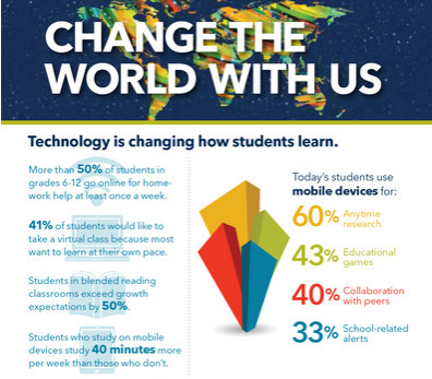

Educational technology is making a huge impact on how students learn, how teachers teach and how education is done.
Get Started for FREE
Sign up with Facebook Sign up with X
I don't have a Facebook or a X account


 Your new post is loading...
 Your new post is loading...
Your new post is loading...
Educational technology is making a huge impact on how students learn, how teachers teach and how education is done.
Beth Dichter's insight:
ISTE has released this new infographic that shares data on how technology in impacting our learners. It is divided into the following categories: * Technology is changing how how students learn. * Technology is changing how teachers teach. * Together we're changing education - one classroom at a time. Before clicking through to the infographic take a moment to think about how technology is used in your school or classroom. Then check out the infographic and see if these statistics surprise you. There may be some new avenues you would like to explore. 
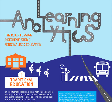
"Learning Analytics is the measurement, collection, analysis and reporting of data about learners and their contexts, for purposes of understanding and optimizing learning and the environments in which it occurs."
Beth Dichter's insight:
This detailed infographic provides an in-depth look at learning analytics. It begins by describing traditional education as a school bus, with the expectation that all students will get to "the finish line together." The infographic then turns to personalized learning, where students would work at their pace and in their way to master material. Analytics play a key role in personalized education. Why? If you use a tool that provides you with the ability to measure, collect, analyze and report data about your students you have the opportunity to adapt curriculum. The infographic shares seven areas that may be considered. From here the infographic moves to the learning analytics cycle which moves to four areas: * Descriptive - What has happened? * Diagnostic - Why has it happened? * Predictive - What will happen? * Prescriptive - What should I do? What comes next? The role of the teacher, which is followed by a What's Next section. There is much to learn about learning analytics in this infographic. You may download the complete infographic from the site.

miguel a. rodriguez's curator insight,
July 19, 2014 5:24 AM
Interesante infografia de google analytics 
John Lemos Forman's curator insight,
July 20, 2014 10:55 PM
Muita expectativa mas ainda poucos resultados concretos ... De qualquer modo, esta se formando uma percepção de que o modelo educacional vai ser fortemente impactado nos próximos anos
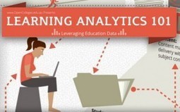
Today we are pushed to determine what is working in education? Data is being collected and in the U.S. teacher evaluations will involve the use of data from a variety of sources. This infographic, Learning Analytics 101, presents a visual representation of what it means to leverage education data looking at issues such as: * What can data do? * When can it be used? * What is "effective learning"? * What are the limitations and costs? * How will it affect the future? If you are trying to wrap your head around learning analytics check out this inforgraphic.
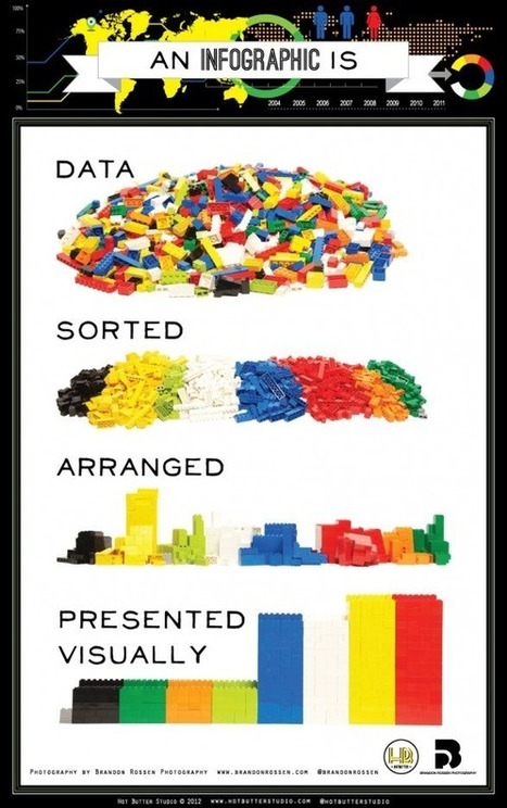
LEGO bricks illustrate the simple idea behind infographics.

So what happens when we teach to the test? Check out this infographic to learn more. Scroll down past the infographic to see detailed information on the material found in Teaching to the Test.
|
Beth Dichter's insight:
Last year I used fast foods as a way to teach students graphing (and nutrition). When surveying students as to their favorite fast food restaurants McDonald's was often at the top. This infographic provides a great deal of information that may be new to students. This infographic shows: * Just how big McDonald's is (and the number may surprise you) * The one location where the Golden Arches are not golden * Where McDonald's are located (a world map with percentages of McDonald's based on area) * The one fast food restaurant that has more locations that McDonald's * The number of employees worldwide (as well as the number of hamburgers and customers served) And much more. You can have fun with maps that look at fast food locations across the US as a tool for students to learn how to interpret visualizations as well as do some calculations. One source you might check out is listed below. * A map of all the McDonald's in the U.S. (published in 2009 and updated in 2010 at http://www.datapointed.net/2010/09/distance-to-nearest-mcdonalds-sept-2010/
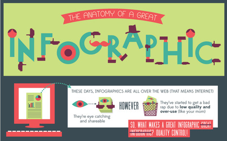
"These days, infographics are all over the web (That means internet). They're eye catching and shareable. However, they've started to get a bad rap due to low quality and over-use. (like your mom) So, what makes a great infographic great infographic? QUALITY CONTROL!"
Beth Dichter's insight:
Are you wondering what your infographic needs to be a great infographic? This post disects an infographic, sharing what is important to include. Sections include: * A brief look at the history of infographics * Does it have all the important parts * Gotta have brains: data and story * Ooo la la visualization * Shareability Additional information as well as links to resources are located under the infographic. If you plan on having students create infographics this year you may want to share this as a tool for discussion as students review infographics and learn to identify great infographics.

Dr. Robin Yap, JD, PhD's curator insight,
September 10, 2013 10:29 AM
What is your takeaway from this? 
Ana C. Robles's comment,
September 12, 2013 9:34 AM
Ideas and elements when creating an info-graph... Good source for designers.

Do you have any idea of how much data is created every minute? Phones, websites, applications...it is mind boggling. Check out this infographic Data Never Sleeps for more information.

In One Minute, Facebook Logs 6 Million Pages Views, Google Handles 2 Million-Plus Search Queries, Twitter Adds More Than 320 Accounts and the Data Deluge Threatens to Overwhelm Network Infrastructure Network infrastructure as a topic lacks the sex...
|


![Things You Never Knew About McDonald's [infographic] | Eclectic Technology | Scoop.it](https://img.scoop.it/LEkQV2Q9psu2DAga-sKHITl72eJkfbmt4t8yenImKBVvK0kTmF0xjctABnaLJIm9)


ISTE has released this new infographic that shares data on how technology in impacting our learners. It is divided into the following categories:
* Technology is changing how how students learn.
* Technology is changing how teachers teach.
* Together we're changing education - one classroom at a time.
Before clicking through to the infographic take a moment to think about how technology is used in your school or classroom. Then check out the infographic and see if these statistics surprise you. There may be some new avenues you would like to explore.