


If you're a visual learner like myself, then you know maps, charts and infographics can really help bring data and information to life. Maps can make a point resonate with readers and this c...
Get Started for FREE
Sign up with Facebook Sign up with X
I don't have a Facebook or a X account


 Your new post is loading...
 Your new post is loading...
Your new post is loading...
If you're a visual learner like myself, then you know maps, charts and infographics can really help bring data and information to life. Maps can make a point resonate with readers and this c...
Beth Dichter's insight:
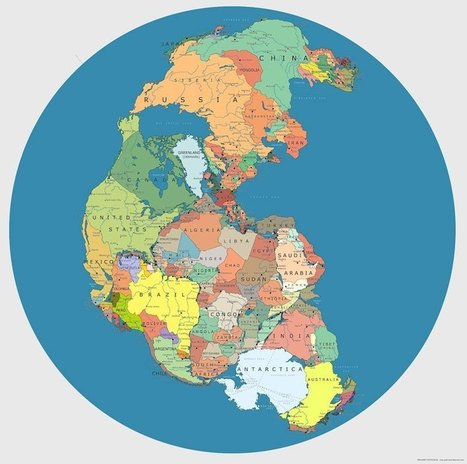
Maps are great visuals for teaching about concepts of space (as in spatial intelligence) and data. This collection of forty maps is diverse and you will find quite a few that you may want to share with students but check them out first. Based on the grade level you teach there may be maps you will not share. Luckily there are links to where the map was first found. A few of the maps are listed below. The one in the image is a "Map of 'Pangea' with Current International Borders." * Countries that do not use the Metric System * The Only 22 Countries in the World that Britain has not Invaded * Map of Time Zones in Antarctica * Global Internet Usage Based on Time of Day * World Map of Earthquakes since 1898 * The 7000 Rivers that Feed the Mississippi River 

"ChronoZoom is an open source community project dedicated to visualizing the history of everything to bridge the gap between the humanities and sciences using the story of Big History to easily understand all this information. This project has been funded and supported by Microsoft Research Connections in collaboration with University California at Berkeley and Moscow State University. You can browse through history on ChronoZoom to find data in the form of articles, images, video, sound, and other multimedia. ChronoZoom links a wealth of information from five major regimes that unifies all historical knowledge collectively known as Big History." An overwhelming amount of information in one location...this will take time to explore!
|
Beth Dichter's insight:
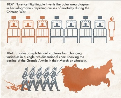
If you were to ask your students when infographics were first created what do you think their answer would be? What would your answer be? This infographic looks at "a timeline of timelines and infographics" and the result may surprise your students. It would be a good to use as an introduction to infographics along with the one that was put out using Legos to answer the question "What is an infographic?" located at
|


good work dude
These are amazing!