


"MyLifeElsewhere allows you to compare your home country with different countries around the world. Ever wonder what your life would be like if you were born somewhere else?"
Via Adam Cooke
Get Started for FREE
Sign up with Facebook Sign up with X
I don't have a Facebook or a X account


 Your new post is loading...
 Your new post is loading...
Your new post is loading...
"MyLifeElsewhere allows you to compare your home country with different countries around the world. Ever wonder what your life would be like if you were born somewhere else?" Via Adam Cooke 
|
This is the truly global project that asks the children of the world to introduce us to the people of the world. We've seen videos and resources that ask the question, "if there were only 100 people in the world, what would it look like?" This takes that idea of making demographic statistics more meaningful one step further by asking student in schools for around the world to nominate some "representative people" and share their stories. The site houses videos, galleries from each continent and analyze themes that all societies must deal with. This site that looks at the people and places on out planet to promote greater appreciation of cultural diversity and understanding is a great find.
Tags: Worldwide, statistics, K12, education, comparison. Via Ness Crouch, Catherine Smyth, Maree Whiteley

savvy's curator insight,
September 3, 2014 12:57 PM
This just makes me realize how the world would be if we only had 100 people rather than the billions we have now. |


Un site d'une grande simplicité d'utilisation bien qu'en anglais. Le principe est de choisir deux pays dans un menu déroulant pour en comparer les principaux indicateurs de développement sous la forme de petites infographies très pédagogiques.
La comparaison est évidemment un processus de raisonnement à mettre en place pour situer et caractériser en géographie. On songera ainsi à l'utilisation d'un tel outil dans le cadre de l'étude des inégalités de développement en classe de 5e et de Seconde, mais aussi pour une mise en perspective sur les Territoires dans la mondialisation en classe de 4e afin de caractériser un PMA, un pays émergent, un pays développé (cf. exemple réalisé pour l'illustration).
Dernière information sur ce site, les statistiques utilisées proviennent des bases de données open source de la CIA américaine.
After studying this comparison tool and using it to find the best of the best and worst of the worst, I picked out some highlights I'd like to share. Monaco is clearly the place to be born, earn, and live. When compared to the USA, the infant mortality rate is 71% less, the life expectancy is 10 years longer @ 84, and you'll earn 62% more money, no doubt because you have ten more years in which to do so. I believe the stats may be skewed a bit in this country comparison as the very rich live there and they have access to the best medical care, and probably don't have very many infants with them when they make the move from elsewhere, hence the low infant mortality rate. Austria is not a bad second choice as you are 33% less likely to be unemployed. On a sobering note, the life expectancy if you live in Namibia is only 52! Yikes, I'm already 53... It's far worse however in Swaziland. The life expectancy is sadly only 50.5 years and you are 44 times more likely to have AIDS than if you lived here. 26.5% of the population has AIDS! Be thankful for where you live and stop complaining, it's far worse on average in nearly all other countries.
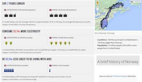
Did you know that with 1/30th the territory of the United States, Norway still has over 25% more coastline? I didn't either until I compared Norway to the United States using My Life Elsewhere. This site is designed allow United States students to imagine how their lives might be different if they were born in a different part of the world. Students would probably die 21 years earlier if they were born in Liberia and 11 times more likely to have died in infancy. Students would be 43.8% less likely to grow up and be unemployed and have 36.3% less babies if they were born in Taiwan. This side-by-side format is a great way to help students help make these statistics real and meaningful. One major drawback: this site only allows users to compare a country to the United States. If you prefer to have students compare, say Cuba to the United Arab Emirates, I would recommend that you try If It Where My Home.