


"Repurposed NASA maps show the racial diversity (and segregation) of the United States in more detail than ever before."
Get Started for FREE
Sign up with Facebook Sign up with X
I don't have a Facebook or a X account


 Your new post is loading...
 Your new post is loading...
Your new post is loading...
"Repurposed NASA maps show the racial diversity (and segregation) of the United States in more detail than ever before." 

"The states are colored red or blue to indicate whether a majority of their voters voted for the Republican candidate, Donald Trump, or the Democratic candidate, Hillary Clinton, respectively. There is significantly more red on a traditional election maps than there is blue, but that is in some ways misleading: the election was much closer than you might think from the balance of colors, and in fact Clinton won slightly more votes than Trump overall. The explanation for this apparent paradox, as pointed out by many people, is that the map fails to take account of the population distribution. It fails to allow for the fact that the population of the red states is on average significantly lower than that of the blue ones.
Via Mike Busarello's Digital Storybooks
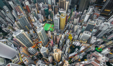
Photographer Andy Yeung used a drone to capture the urban density of Hong Kong - where more than 100,000 people live in 40 square meter apartment - for his project Urban Jungle. Via Tony Hall

Tony Hall's curator insight,
April 17, 2016 7:51 AM
These images are amazing. A fantastic discussion starter for IB Geography Urban Environments.

12 maps show the sometimes surprising way the world's people are squished together Via Dawn Haas Tache

A new study suggests vehicular travel affects children's ability to navigate their neighborhood and connect to their community.
We learn about the places around us by exploring. Literally our mental map is formed by making choices (in part through trial and error) and that process strengthens our spatial perception of the neighborhood. Research is showing that kids with a 'windshield perspective' from being driven everywhere are not able to draw as accurate maps as children for who walk and bike their neighborhood. The built environment and the transportation infrastructure in place play a role in developing spatial thinking skills for young minds.
This is a compelling article with some important implications. What are the ramifications for geographers? City planners? Educators? Families moving to a new neighborhood? Via Michael Miller

Victoria McNamara's curator insight,
December 11, 2013 10:52 AM
We may not realize it but when we take our kids out on drives to run errands or if we move to a different area we are ruining their understanding of the area they live in. Children often have a hard time of figuring out where they are if they constantly in a car looking at new places. This can cause them to lack a sense of direction and maybe have trouble remembering streets or landmarks near their homes.
In the most innovative incubators of urban research, the lessons of Jane Jacobs are more vital than ever.
In the past few years, a remarkable body of scientific research has begun to shed new light on the dynamic behavior of cities, carrying important implications for city-makers. Researchers at cutting-edge hubs of urban theory like the University College London and the Santa Fe Institute have been homing in on some key properties of urban systems—and contradicting much of today's orthodoxy. Their findings have begun to feed into recent and upcoming gatherings on the future of cities—including lead-in events for the U.N.'s big 2016 Habitat III conference on sustainable development—and arming leaders in the field with new ammunition in the global battle against sprawl. Tags: density, urbanism, housing, urban, planning, unit 7 cities, labor. Via Dawn Haas Tache

"Most state borders were drawn centuries ago, long before the country was fully settled, and often the lines were drawn somewhat arbitrarily, to coincide with topography or latitude and longitude lines that today have little to do with population numbers. Most state borders were drawn centuries ago, long before the country was fully settled, and often the lines were drawn somewhat arbitrarily, to coincide with topography or latitude and longitude lines that today have little to do with population numbers." Tags: cartography, mapping, visualization, regions, gerrymandering, political, mapping, census, density.
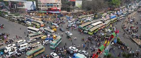
There are only 650 major intersections here—but somehow only 60 traffic lights. Via Mr. David Burton

Sarah Cannon's curator insight,
December 14, 2015 9:50 AM
Its amazing how much traffic can affect air pollution, especially in such a small place. Dhaka is heavily populated, traffic in this small but heavily populated community is very stressful, even to look at in the photo provided above. I can't imagine living in such a heavily populated area. I guess you can compare it to downtown New York City. However the pollution is more intense in Dhaka than it is in NYC. 
Matt Ramsdell's curator insight,
December 14, 2015 3:35 PM
This is a prime example of a megacity and the population that it cohabits the city. The huge populaiton that is se densley populated in such a small area creates for a large traffic and pedestrian issues. After watching the video you would think that there would be more accidents but living in a city like this you would get use to the population ways and learn the ways of life. 
Alex Vielman's curator insight,
December 15, 2015 12:28 AM
Dhaka, the capital of Bangladesh, suffers from overpopulation. As funny and nerve-wrecking this video was, it shows an instability on how important technology is in order for safety. In the video we can see cars just passing by fast and furociuosly within centimeters of crashing in the car in front of it. There is no one guiding traffic and nonetheless, any stop and traffic lights on the streets. It is a free for all in the middle of the capital when it comes to driving and this is a lack of safety for the people in Bangladesh. It is almost impossible for people to cross the road without a high risk of getting driven over. We can also see how there are so many cars in the are was well. The region is very overpopulated and to think how worse it would be if everyone in the area owned a car.
Over the years, ISS astronauts have had a rare opportunity to witness climate change on Earth from space. Via Sally Egan

Sally Egan's curator insight,
March 30, 2014 7:29 PM
A great illustation of the changes to the environment as a result of increasing technology and population. Plays for 1minute 30.
Sally Egan's curator insight,
March 30, 2014 7:34 PM
A short but fascinating illustration of the rapid changes to areas of teh Earth, observed by astronauts since 2000. Plays for 1 minute 30. |

"I was inspired by 50% of the U.S. lives in these counties. map. I was wondering what the equivalent map for Canada would look like. I couldn't find one, so I created my own."

Ivan Ius's curator insight,
March 23, 2017 5:35 PM
Geographic Thinking Concepts: Spatial Significance, Patterns and Trends, Geographic Perspective

Kelsey McIntosh's curator insight,
January 25, 2018 7:38 PM
This post is particularly interesting because it shows just how the population is impacted by the geography of the land. Like most civilizations, fifty percent of Canada's population is centered around waterways, an excellent resource for trade and communication to the bordering nation.
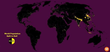
"Data viz extraordinaire Max Galka created this map using NASA’s gridded population data, which counts the global population within each nine-square-mile patch of Earth, instead of within each each district, state, or country border. Out of the 28 million total cells, the ones with a population over 8,000 are colored in yellow."
Tags: population, density, mapping, visualization. Via Clairelouise, Mike Busarello's Digital Storybooks

Brian Weekley's curator insight,
July 27, 2016 10:47 AM
Great simple map of world population. Scroll down and look at the U.S. It reflects the global trend. This also has political implications, as evidenced by voting patterns in the 2012 presidential election. Elections are dependent upon votes, which come from people, which are primarily clustered in cities. Election campaigns would use this data to plan their schedules as to where to focus their campaigning efforts. For the folks in Wyoming, they rarely see candidates other than during the primaries. And these world populationclusters have been relatively consistent historically, particularly in south and east Asia. Northern India has serious carrying capacity challenges. Notice the clusters along the Nile- evidence of arable land.
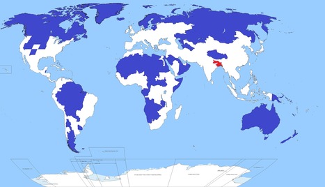
Well, this is kind of crazy. Only 5 per cent of the world's population lives in the regions of this map shaded blue. Another 5 per cent lives in the area shaded red. Yoinks.
Tags: population, density, South Asia.

Carlos Fosca's curator insight,
January 6, 2016 6:34 AM
Parece realmente una broma, pero la zona coloreada de rojo alberga a 350 millones de personas sobre una superficie que arroja una densidad poblacional de 1,062 habitantes por Km2. Si esto se compara con el país más densamente poblado de Europa, que es Holanda, con una densidad de 409 habitantes/Km2 o incluso con el departamento de Lima (269.1 habitantes /Km2) vemos que hay una gran diferencia. Pero el Perú también tiene propio su punto rojo en términos de densidad poblacional (no en términos de población absoluta). ¿Saben que lugar es este? Pues la provincia Constitucional del Callao que tiene una densidad poblacional de 7,159.83 habitantes/Km2 (2015). 
Richard Aitchison's curator insight,
March 19, 2018 11:52 AM
This map shows how much population is in one certain area. It is amazing to see all the land in the blue area which roughly adds up to 5% of the population, while that small area in red is also 5% of the worlds population. One can see just from the map some of the difficulties this might cause. The area in red has a major overpopulation problem and has a major need for resources for all of the people that live there. It also causes major divisions in socioeconomic and we tend to see many slum cities develop which on most likely built in poor geographical area. This can cause many issues in this area and we also see at the end of the article that with sea changes this could cause major problems in the near future in this area. If we were to see population move out of this area where would they go? We have major issues currently with a moving population in Europe, however it will be interesting to see where this population would move and how that would effect possible political policies of other South Asian countries.

Katie Kershaw's curator insight,
April 5, 2018 2:19 PM
If someone looked at this map and didn't have background knowledge on the population distribution on earth, they would probably think this map is fake. It's pretty unbelievable that one tiny spot of land has the same amount of people living on it than pretty much the rest of the entire world. The biggest thing that this map indicates is that earth's population is not evenly distributed even a little bit. This is partially because there are parts of the world that are uninhabitable, but that doesn't fully explain why so many people live in that tiny area. The red spot also tells me that people living in that area are going to have a very different experience than most other humans. Their resources are going to have to be divided thoroughly and they probably aren't going to get away with spending a lot of time without being in contact with other people. The end of this article pointed out another big problem with this dense area of settlement- if something were to happen to this area which either wiped out resources or killed people, the earth's population would drop significantly in a really short period of time. After looking at this, I regret how angry I used to be about sharing a room with my sister. Now that I have my own bedroom I can see that I was actually pretty lucky, because at least I didn't have 5% of the world's population within a few hundred miles of me.

"What, exactly, is a city? Technically, cities are legal designations that, under state laws, have specific public powers and functions. But many of the largest American cities — especially in the South and West — don’t feel like cities, at least not in the high-rise-and-subways, 'Sesame Street' sense. Large swaths of many big cities are residential neighborhoods of single-family homes, as car-dependent as any suburb. Cities like Austin and Fort Worth in Texas and Charlotte, North Carolina, are big and growing quickly, but largely suburban. According to Census Bureau data released Thursday, the population of the country’s biggest cities (the 34 with at least 500,000 residents) grew 0.99 percent in 2014 — versus 0.88 percent for all metropolitan areas and 0.75 percent for the U.S. overall. But city growth isn’t the same as urban growth. Three cities of the largest 10 are more suburban than urban, based on our analysis of how people describe the neighborhoods where they live."

Sammie Bryant's curator insight,
May 27, 2015 12:07 AM
This article accurately depicts the difference between a normal city 50 years ago and a city today, as well as the continuing spread of suburbanization. For example, Austin, the capital of texas, a hustling, bustling always busy area, is predominantly suburban. As cities and countries continue to advance and develop and its citizens become more successful and family oriented, suburban homes for families will become more needed than something smaller, like condos or studio apartments. As the needs of the cities change, the structure of the city changes as well. This applies to our final unit of APHUG: Cities and Urban Land Use.
From
laist

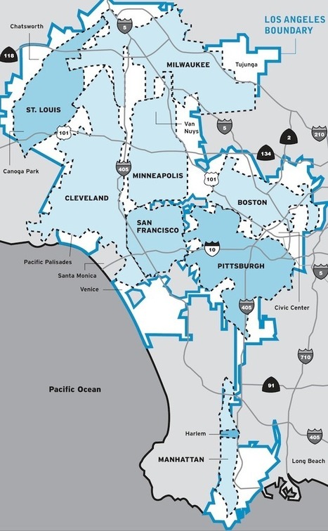
A map that has been making the rounds on the internet demonstrates how you can fit 7 major U.S. cities plus New York's most famous borough within Los Angeles city limits.
So Los Angeles is big, but, LA's spatial extent is in part due to it's history with transportation (ripped out the streetcars to let the automobile and freeway take over). How do density and transportation affect cities? Via Michael Miller
"How much does size really matter? Judging by this tiny home in France, not a whole lot -- as long as the space is functional. On the seventh floor of an apartment building in Paris, there's an 86-square-foot apartment complete with a bed, kitchen, bathroom, table and chairs, closet, bathroom and storage space." --HPost

John Nieuwendyk's curator insight,
November 23, 2014 10:16 PM
With an ever-growing urban population spatial design is important in maintaining functionality, efficiency and orderliness. The apartment building in Paris is especially interesting. It is practical and functions well enough to where a person can live comfortably in a markedly small but efficient space. 
Ryann Pinnegar's curator insight,
July 6, 2015 3:02 AM
This tiny home is amazing! It is like the setting for a futuristic story.
"Facing a mounting housing shortage, squatters have transformed an abandoned skyscraper in downtown Caracas into a makeshift home for more than 2,500 people."

Kristin Mandsager San Bento's curator insight,
March 5, 2015 2:13 PM
The squatters have made their own community complete with services and mini marts. This tells me there is not enough affordable housing if the people of Caracas are willing to live in dangerous conditions. Caracas government needs to build affordable housing or create better paying jobs so the citizens can spend the money in the community. Its a cycle that needs everyone's participation to work to build a sustaining economy. 
Gene Gagne's curator insight,
November 22, 2015 10:57 AM
we have talked about this in class. These people have learned to adapt and find ways to use electricity, running water. We have seen videos of other cities in countries with electrical cables and sewage water out in the open and people find ways to tap into it. The building reminds me of the abandon mills in R.I. where homeless people frequent to beat the harsh elements and sleep at night. They build small fires and use different areas for bathroom visits. The difference is our brick unoccupied mills find a way to catch fire and the city levels them to the ground. This is definitely unsafe but goes to show when you have no place to live its amazing how people find ways to survive and kind of build their own community. What I found disturbing is the people outside the neighborhood angry because the squatters took over the building. All of a sudden they complained about the safety of the squatters when in all reality they are safer because they are acting as a self community and know they need each other to survive. If the government or city officials or citizens of the neighborhood are that concerned then they can find a way to fix up the building.

"Tracking changes in the shape of American cities over 10 years reveals which cities pack the most into a small space, but don't worry, sprawlers: Los Angeles shows you can change your fate." Today’s nearly 314 million U.S. residents will expand to 401 million in less than 40 years. Wherever you fall on the cultural spectrum between country and city mouse, the fact remains that we simply won’t be able to use up resources the way we do now in sprawling suburbs shaped by car culture. Tags: density, sustainability, housing, urban, planning, unit 7 cities.

"Only 2% of Australia's population lives in the yellow area. "

Nicole Canova's curator insight,
May 2, 2018 4:13 PM
This distribution of Australia's population should come to no surprise to people who have a vague idea of the continent's geography. The coastal areas are by far preferable to the desert areas of the continent's interior. A good example of how geography impacts population density and where people decide to live.

Stevie-Rae Wood's curator insight,
December 9, 2018 10:20 PM
The population of Australia is highly concentrated at the coast. Only about two percent of the population lives in the yellow shaded area on the image present in the article. The reason for the middle of Australia being so lightly populated is because the harsh climates. Where most people do not live the climate resembles the Sahara desert, which is very dry, and lacks rainfall. While the coastal areas where most of the population is concentrated resembles climates like Brazil, California, and India. These climates that most people live are not as harsh on the human and better for agriculture, cattle and port cities are known to be economically more powerful and populated. Since they access to the sea is so imperative these days.

Matt Danielson's curator insight,
December 12, 2018 4:38 PM
The area often referred to as the "Outback" of Australia is one of the most sparsely populated areas on the planet. Due to the harsh environment and lack of resources not many people live their at all with the exceptions being some scientist, anthropologist, and native aboriginal tribes. This environment to many seems like a horrible, desolate place. Hence why it was a great setting for Mad Max to help Illustrate the gravity and desperateness of the situation. To people that know the land better there is a lot there and a vast array of species only found in the Outback.
|


This interactive map of population density in the United States also shows ethnic categories as defined by the U.S. census. Please explore this map at a variety of scales and in distinct locales.
Questions to Ponder: Is this a map of ethnic diversity patterns or is it a map of racial segregation? How come? Is there additional information that you would need to decide? This review of the map on Wired and Atlantic Cities described this map as a map depicting segregation: why would they say that?
Tags: mapping, density, ethnicity, race.