Test your knowledge with amazing and interesting facts, trivia, quizzes, and brain teaser games on MentalFloss.com.
Via Alex Smiga
Get Started for FREE
Sign up with Facebook Sign up with X
I don't have a Facebook or a X account


 Your new post is loading...
 Your new post is loading...
Your new post is loading...
Test your knowledge with amazing and interesting facts, trivia, quizzes, and brain teaser games on MentalFloss.com. Via Alex Smiga 

Alex Smiga's curator insight,
August 6, 2017 8:43 AM
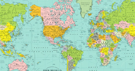
Well this makes the Powder Keg of pre-WWI Europe look tame.
Sign up to comment
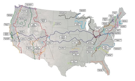
Plan your next big hike with this map of America's most-loved long trails. Via Mike Busarello's Digital Storybooks

"I was inspired by 50% of the U.S. lives in these counties. map. I was wondering what the equivalent map for Canada would look like. I couldn't find one, so I created my own."

Ivan Ius's curator insight,
March 23, 2017 5:35 PM
Geographic Thinking Concepts: Spatial Significance, Patterns and Trends, Geographic Perspective

Kelsey McIntosh's curator insight,
January 25, 2018 7:38 PM
This post is particularly interesting because it shows just how the population is impacted by the geography of the land. Like most civilizations, fifty percent of Canada's population is centered around waterways, an excellent resource for trade and communication to the bordering nation.

"Back in the ’70s, almost a hundred reporters around the country – Washington Post bureau chiefs, rovers, freelancers and me, their desk-bound editor – were trying to get our arms around how North America worked, really. Not how it should work. But how it did work. Forget those nice neat rectangles in the middle of the U.S. Let’s be real: The mountains of western Colorado are totally alien from the wheat fields of eastern Colorado. And Miami is part not of Florida, but its own watery Caribbean realm. And what a terrible idea is 'California.' It behaves as if it covers three warring civilizations. The result was my 1981 book, 'The Nine Nations of North America.' The reader reaction was astonishing. This map – drawn to anticipate the news – revealed something much deeper. It turned out to be a map of culture and values, which have nothing to do with our perversely drawn state and national boundaries." Via GTANSW & ACT

GTANSW & ACT's curator insight,
December 17, 2016 11:56 PM
An interesting look at settlement patterns in the USA if using this to compare with spatial patterns in Australia. A deeper examination will reveal reasons for differences in settlement patterns between the two nations.
Syllabus Students investigate differences in urban settlement patterns between Australia and another country, for example:
Geoworld 9 NSW Chapter 7: Urban settlement patterns Australia and the USA 7.1 Population concentrated near coasts 7.2 Urbanisation of indigenous populations 7.3 Is Australia a nation of tribes? 7.4 Nature in control 7.5 Coastal colonial cities and ports 7.6 USA: Settlement, geography and history 7.7 Large cities: Contrasting patterns 7.8 Sprawling suburbs: similar patterns 7.9 Consequences of urban concentration Geothink Activities 3 and 4.
Kelsey McIntosh's curator insight,
January 25, 2018 7:46 PM
Because of its sheer size and perfect geographical location, America is nearly impossible to place into specific regions. This map, however, shows much more about the country than the typical regions named after the cardinal directions. By categorizing the country that way there are assumptions made about culture. In this map, I see that as well, but it has divided states which can ( and should) be categorized as more than one region.

tyrone perry's curator insight,
February 7, 2018 10:49 PM
This article is fascinating how the author depicts the nine nations from then till now. most things are perceived relatively the same thru out the course of time. the map definitely shows how the nine nations are completely different from each other and what they are known for. even to this day we look at them no different now. no matter how many times people move they adapt to that area and that area stays the same.

From
qz

"The map above, created with data from Telegeography, shows how those cables have developed since 1990. Most existing cables were constructed during a period of rapid growth in the mid-2000’s. This was followed by a gap of several years during which companies steadily exhausted the available capacity. Over the last few years, explosive new demand, driven by streaming video, has once again jumpstarted the the construction of new cables." Via GTANSW & ACT

Lee Hancock's curator insight,
November 1, 2016 5:42 PM
Telecommunication linkages between continents, regions and cities. Note the strength of the trans-atlantic connections. These communication linkages enable communication between these areas.
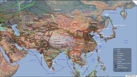
"If you want to understand the world of tomorrow, why not just look at a good map? For my (Parag Khanna) new book, Connectography, I researched every single significant cross-border infrastructure project linking countries together on every continent. I worked with the world’s leading cartography labs to literally map out what the future actually — physically — will look like.
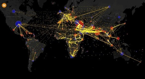
This map shows the estimated net immigration (inflows minus outflows) by origin and destination country between 2010 and 2015. Blue circles = positive net migration (more inflows). Red circles = negative net migration (more outflows). Each yellow dot represents 1,000 people. Hover over a circle to see that country’s total net migration between 2010 and 2015. […]

Colleen Blankenship's curator insight,
September 10, 2016 11:27 PM
Read and scroll all the way down for all the information and maps! Pay attention to the blue circles which represent more inflow of migration and red circles which represent more outflows. Hover over the circles for more information!

"Half of Canada’s 33.5 million people live in the red part, the other in the yellow. More population divided maps (Source: reddit.com)"

JeanneSilvey's curator insight,
November 17, 2015 10:09 AM
A great illustration of population concentration and high density in Urban centers. 4.6 million of the remaining 17 million (approx.) live in British Columbia.

Gene Gagne's curator insight,
November 17, 2015 11:41 AM
First economically for trade routes you have the St. Lawrence river which was originally the most influential route for French explorers. You have Toronto the Canada's financial center which forms the core of the "Golden Horseshoe" region, which wraps around the western end of Lake Ontario, population wise a quarter of Canada's population lives here. Politically it makes sense that government would be set up in that area because of the population in that area. Which population leads to the social aspect because all activities of night life, restaurants, businesses, entertainment, malls, etc. are located in this area. And lastly, it makes easy access for United States and Canada to exchange tourism and jobs and goods. 
Corey Rogers's curator insight,
December 13, 2018 1:49 PM
It's crazy to think how big Canada is and yet the majority of the population lives right on the border. Canada is almost in the Arctic Circle so most of the time you're going to have frigid temperatures and inhabitable land so its going to push people closer to the equator.
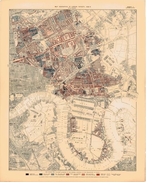
British businessman, philanthropist, and social reformer Charles Booth spent years gathering the data to produce these color-coded maps of London poverty, which he published as part of a huge project titled The Labor and Life of the People of London.
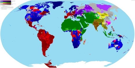
The incredibly detailed map of the world's religions shows what the biggest religion is by census area in each country, along with its level of support. Via Mike Busarello's Digital Storybooks

Madison Roth's curator insight,
April 7, 2017 12:47 PM
This map relates to my human geography class because it shows the distribution of religion, and that is something my class is learning about. I think the distribution of religion is interesting to view because of the enormous level of diversity. Comparing the spread from origins of different religions to one another, the size along with the support it receives are even more actions one would practice.

Chris Rouse's curator insight,
April 11, 2017 4:34 PM
This article is about the different religions around the world and what areas have the largest amount of supporters for a certain religion. This connects to our lessons because we learned about the different religions and where they are located.

Aaron Evans's curator insight,
April 25, 2017 9:27 PM
There are many religions throughout the world. And it is interesting to see where the religions are distributed throughout regions. Christian is the biggest religion in the world, I was surprised to see the tiny bits of christian in Asia. It is an overall very detailed map.

This map, annotated by Navy signalman Homer Bluford Clonts, tracks the geographical trajectory of the sailor's service on the USS Sheridan, the SS Young America, and the USS Eldorado, from 1943 to 1945.

Kristen McDaniel's curator insight,
October 13, 2015 10:53 AM
Very cool primary source for students - an annotated map from WWII.
Historic maps from the Library of Congress offer a fascinating, bird's eye view of old San Francisco: http://t.co/A5uYiBytps
|

Have you ever sat on a beach and wondered what’s across the ocean? If you think you can figure out the answer just by looking at a map, read on. You may be surprised. I was. To ask the question more concretely, what’s across the ocean from New York? It doesn’t really matter which beach […] Via Nancy Watson

Nancy Watson's curator insight,
June 10, 2017 10:50 AM
The why of where! Sometimes our global perspective is way off. The world is NOT flat! Pilots (air and sea), and geographers know the Great Circle routes are the "straight line" routes of our sperical earth.

European settlement began in the region around Chesapeake Bay and in the Northeast, then spread south and west into the Appalachian Mountains.
Questions to Ponder: How did European immigrants settle along the East Coast? How did geography determine settlement patterns?
Tags: migration, map, historical, colonialism, USA, National Geographic. Via CT Blake
The designers behind the “Alternative Love Blueprint” are back with a map of the world. Only this map uses song titles instead of place names. Via Rebecca Cofield

Ruth Reynolds's curator insight,
January 23, 2017 3:41 AM
Lots of fun here and how long did this take to put together?

PIRatE Lab's curator insight,
December 10, 2016 10:30 AM
Another example is the long line of defining the new geography.

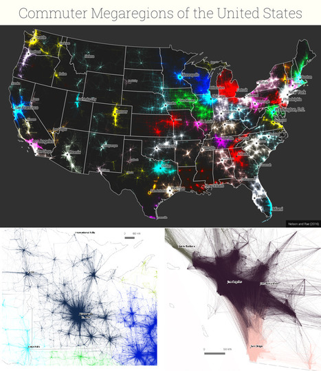
Boris Limpopo's curator insight,
December 11, 2016 1:43 AM
Le macroregioni americane con i dati del pendolarismo

History, race, religion, identity, geography: The 2012 election county-level map has many stories to tell, including about the 2016 race.

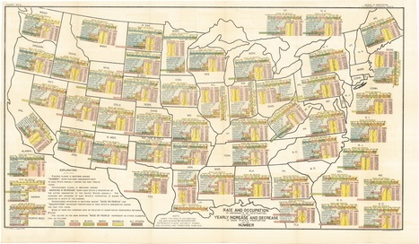
The US is a big, complicated place that has undergone some big changes over its 238 years, and even in the last few decades. Here are 21 charts that explain what life is like today in the US — who we are, where we live, how we work, how we have fun, and how we relate to each other.
Tags: USA, map, map archives.

Michael Harding's curator insight,
July 11, 2016 7:22 PM
A really challenging set of charts from the US.

Parag Khanna argues that these five maps are critical to understand the world we live in.
Maps shape how we see the world. But most of the maps hanging on our walls are dangerously incomplete because they emphasize political borders rather than functional connections.

David Stiger's curator insight,
September 6, 2018 9:51 PM
It is highly doubtful President Trump read anything remotely similar to this piece. The maps fully embrace the brave new world of globalized trade, politics, and cooperation - something that is at odds with "America first" chants for isolation. China appears to be ready to take the lead in this new globalized order as it focuses on massive multi-continental infrastructure projects to increase its trading capabilities. It's also interesting to think of Canada as a greater potential partner than before because of all the various connections via transportation and communication. Canada could produce a majority of our food supply as climate change dries the world over. This article is clearly saying that geopolitical change is coming and that the leadership of the U.S. would be wise to have a plan. The only part of this article that raised eyebrows was the reorganization of the United States from 50 states to 7 regions with each region centered around a major city. Essentially it sounds like seven colossal states. The idea has potential but our adversaries, like Russia, also want to see the U.S. break apart into several regions; divide and conquer is a time tested strategy.
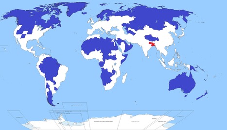
Well, this is kind of crazy. Only 5 per cent of the world's population lives in the regions of this map shaded blue. Another 5 per cent lives in the area shaded red. Yoinks.
Tags: population, density, South Asia.

Carlos Fosca's curator insight,
January 6, 2016 6:34 AM
Parece realmente una broma, pero la zona coloreada de rojo alberga a 350 millones de personas sobre una superficie que arroja una densidad poblacional de 1,062 habitantes por Km2. Si esto se compara con el país más densamente poblado de Europa, que es Holanda, con una densidad de 409 habitantes/Km2 o incluso con el departamento de Lima (269.1 habitantes /Km2) vemos que hay una gran diferencia. Pero el Perú también tiene propio su punto rojo en términos de densidad poblacional (no en términos de población absoluta). ¿Saben que lugar es este? Pues la provincia Constitucional del Callao que tiene una densidad poblacional de 7,159.83 habitantes/Km2 (2015). 
Richard Aitchison's curator insight,
March 19, 2018 11:52 AM
This map shows how much population is in one certain area. It is amazing to see all the land in the blue area which roughly adds up to 5% of the population, while that small area in red is also 5% of the worlds population. One can see just from the map some of the difficulties this might cause. The area in red has a major overpopulation problem and has a major need for resources for all of the people that live there. It also causes major divisions in socioeconomic and we tend to see many slum cities develop which on most likely built in poor geographical area. This can cause many issues in this area and we also see at the end of the article that with sea changes this could cause major problems in the near future in this area. If we were to see population move out of this area where would they go? We have major issues currently with a moving population in Europe, however it will be interesting to see where this population would move and how that would effect possible political policies of other South Asian countries.

Katie Kershaw's curator insight,
April 5, 2018 2:19 PM
If someone looked at this map and didn't have background knowledge on the population distribution on earth, they would probably think this map is fake. It's pretty unbelievable that one tiny spot of land has the same amount of people living on it than pretty much the rest of the entire world. The biggest thing that this map indicates is that earth's population is not evenly distributed even a little bit. This is partially because there are parts of the world that are uninhabitable, but that doesn't fully explain why so many people live in that tiny area. The red spot also tells me that people living in that area are going to have a very different experience than most other humans. Their resources are going to have to be divided thoroughly and they probably aren't going to get away with spending a lot of time without being in contact with other people. The end of this article pointed out another big problem with this dense area of settlement- if something were to happen to this area which either wiped out resources or killed people, the earth's population would drop significantly in a really short period of time. After looking at this, I regret how angry I used to be about sharing a room with my sister. Now that I have my own bedroom I can see that I was actually pretty lucky, because at least I didn't have 5% of the world's population within a few hundred miles of me.
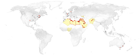
At least a dozen countries have had attacks since the Islamic State, or ISIS, began to pursue a global strategy in the summer of 2014. Via Mike Busarello's Digital Storybooks

John Puchein's curator insight,
November 16, 2015 8:50 AM
This explain how ISIS operates spatially, which is a component of APHG. It also shows how ISIS has expanded and threatens more countries in the region. 
Chelsea Martines's curator insight,
November 21, 2015 3:41 PM
The Paris attacks from ISIS are now being discovered as linked to other attacks that ISIS has planned out. They have up until now according to the article, done 'lone wolf' attacks and now are changing to bigger and city kind of attacks across the globe. They are taking over much of the Middle East and Africa, in hopes to make that area chaotic enough to start more global conflict and another world war, accoring to the article. There have been studies and research in tracking ISIS and they have found that attacks in many other cities in the world have been inspired by ISIS as well.

Matthew Richmond's curator insight,
December 2, 2015 12:23 PM
These maps were very helpful in understanding the spread and threat of ISIS. It also helps the understanding of just what a wide range of places they have attacked is. They are capable of striking much of the world in the name of fundamentalism. However, the video of Muslim's chanting is one of those things that can kind of turn down the fear, especially of admitting refugees, that has gripped much of the world. We are as safe as we can be, but idea's are bulletproof and there's no end in sight to the elimination of Islamic Fundamentalism.
Animated map of the contiguous 48 States showing every country boundary change from 1629 onwards, and State border changes from 1784. Year and Month are show...
"Americans' understanding of who counts as 'white' has changed dramatically throughout the country's history and even over the last century alone. This map — which covers a decade of immigration to the US, from 1892 to 1903 — is a dramatic illustration of what it looked like when 'white' wasn't the same thing as European. Mouse over any part of the map to magnify it."
Tags: race, historical, USA, map. Via Dawn Haas Tache

Caterin Victor's curator insight,
November 10, 2014 8:43 AM
Up to me, race and colour don`t matter. Most important is the personality. America have now a black President. Is it better??

This map, published by South Dakotan Orlando Ferguson in 1893, offers a unique vision of the Earth as a concave field, with a round convex area in the middle.
|