Human Interest
198.8K views | +0 today
Follow
Human Interest
Your new post is loading...
Scooped by Skuuppilehdet
Scoop.it!

Identifying Illegal Overfishing

Identifying Illegal Overfishing | Human Interest | Scoop.it

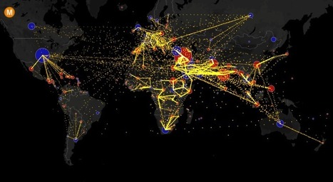
"The vast majority of fishing vessels follow the rules governing fishing – but many are not, and these bad actors can cause a lot of damage. Vessels may take too many fish ­– overfishing – which is causing our fisheries to collapse. Then there is the problem of illegal fishing, which can occur in protected areas, in another country’s waters or on the high seas. This threatens jobs and food security for millions of people, all around the world.


No comment yet.
Rescooped by Skuuppilehdet from IB Geography @NIST
Scoop.it!

Top 20 most amazing maps you've ever seen

Top 20 most amazing maps you've ever seen | Human Interest | Scoop.it
Over the years we've shared with you hundreds of amazing maps featuring them on the website and as #GeoawesomeMapOfTheDay on our social media channels. We've decided to select 20 most stunning maps we've ever shared or wrote about. It was a difficult choice  and we would like to add to the list maps that we've missed,…

Via Andy Dorn
No comment yet.
Rescooped by Skuuppilehdet from U.S HISTORY SHACK : MIKE BUSARELLO
Scoop.it!

America's Best Long Trails

America's Best Long Trails | Human Interest | Scoop.it
Plan your next big hike with this map of America's most-loved long trails.

Via Mike Busarello's Digital Storybooks
No comment yet.
Scooped by Skuuppilehdet
Scoop.it!

Maps of racial diversity in the United States

Maps of racial diversity in the United States | Human Interest | Scoop.it

"Repurposed NASA maps show the racial diversity (and segregation) of the United States in more detail than ever before."

Deanna Wiist's curator insight, September 12, 2017 9:02 PM

This interactive map of population density in the United States also shows ethnic categories as defined by the U.S. census.  Please explore this map at a variety of scales and in distinct locales.   


Questions to Ponder: Is this a map of ethnic diversity patterns or is it a map of racial segregation?  How come?  Is there additional information that you would need to decide?  This review of the map on Wired and Atlantic Cities described this map as a map depicting segregation: why would they say that? 


Tags: mapping, density, ethnicity, race.

Scooped by Skuuppilehdet
Scoop.it!

Flat Earth Theory

Rescooped by Skuuppilehdet from IB Geography @NIST
Scoop.it!

All the World’s Immigration Visualized in 1 Map

All the World’s Immigration Visualized in 1 Map | Human Interest | Scoop.it
This map shows the estimated net immigration (inflows minus outflows) by origin and destination country between 2010 and 2015. Blue circles = positive net migration (more inflows). Red circles = negative net migration (more outflows). Each yellow dot represents 1,000 people. Hover over a circle to see that country’s total net migration between 2010 and 2015. […]

Via Andy Dorn
No comment yet.
Rescooped by Skuuppilehdet from AP HUMAN GEOGRAPHY DIGITAL STUDY: MIKE BUSARELLO
Scoop.it!

Google Maps Smarty Pins

Google Maps Smarty Pins | Human Interest | Scoop.it
Smarty Pins is a Google Maps based geography and trivia game.

Via Mike Busarello's Digital Storybooks
No comment yet.
Rescooped by Skuuppilehdet from AP HUMAN GEOGRAPHY DIGITAL STUDY: MIKE BUSARELLO
Scoop.it!

WORKSHEETS: Climate Migrants

WORKSHEETS: Climate Migrants | Human Interest | Scoop.it

"The ESRI storymap on climate refugees does a phenomenal job sampling locations in the world that experience migration effects as a result of climate change. Attached is a guided worksheet that accompanies the ESRI Climate Migrant Storymap."


Via Michael Miller, Mike Busarello's Digital Storybooks
Ivan Ius's curator insight, January 26, 2017 2:51 PM
Geographic Concepts: Spatial Significance, Patterns and Trends, Interrelationships, Geographic Perspective
Scooped by Skuuppilehdet
Scoop.it!

America's 'Megaregions' using Commuter Data

America's 'Megaregions' using Commuter Data | Human Interest | Scoop.it
New maps use math to define the amorphous term.
PIRatE Lab's curator insight, December 10, 2016 10:30 AM
Another example is the long line of defining the new geography.
Boris Limpopo's curator insight, December 11, 2016 1:43 AM
Le macroregioni americane con i dati del pendolarismo
Tom Cockburn's curator insight, December 13, 2016 3:53 AM
Plenty of space in the middle it seems
Scooped by Skuuppilehdet
Scoop.it!

How to Create an Interactive Map with Visme

How to Create an Interactive Map with Visme | Human Interest | Scoop.it
A step-by-step tutorial on how to create an interactive map with Visme, a free online infographic and presentation tool.
Tom Cockburn's curator insight, December 13, 2016 3:55 AM
Create your own maps
António Leça Domingues's curator insight, December 19, 2016 6:44 AM
Criar um mapa interativo com Visme.
Bart van Maanen's curator insight, December 19, 2016 10:02 AM
Mooie tool om een kaart van data te voorzien.
Scooped by Skuuppilehdet
Scoop.it!

A More Accurate World Map Wins Prestigious Japanese Design Award

A More Accurate World Map Wins Prestigious Japanese Design Award | Human Interest | Scoop.it

"To design a map of the world is no easy task. Because maps represent the spherical Earth in 2D form, they cannot help but be distorted, which is why Greenland and Antarctica usually look far more gigantic than they really are, while Africa appears vastly smaller than its true size. The AuthaGraph World Map tries to correct these issues, showing the world closer to how it actually is in all its spherical glory."

Rescooped by Skuuppilehdet from IB Geography @NIST
Scoop.it!

The veins of America: Stunning map shows every river basin in the US

The veins of America: Stunning map shows every river basin in the US | Human Interest | Scoop.it
A stunning new map from Imgur user Fejetlenfej shows the complex network of rivers and streams in the contiguous United States, highlighting the massive expanse of basins across the country.

Via Andy Dorn
No comment yet.
Scooped by Skuuppilehdet
Scoop.it!

All Maps Are Biased. Google Maps’ New Redesign Doesn’t Hide It.

All Maps Are Biased. Google Maps’ New Redesign Doesn’t Hide It. | Human Interest | Scoop.it

"Google rolled out its new Maps design...from a navigational tool to a commercial interface and offers the clearest proof yet that the geographic web—despite its aspirations to universality—is a deeply subjective entity."

No comment yet.
Rescooped by Skuuppilehdet from AP HumanGeo
Scoop.it!

Mapping the World's Migration Flows

Mapping the World's Migration Flows | Human Interest | Scoop.it
Visualizing the flow of the world's migrants from country to country.


Based on data from the U.N. Population Division, this map shows the estimated net migration (inflows minus outflows) by origin and destination country between 2010 and 2015.

Blue circles = positive net migration (more inflows). Red circles = negative net migration (more outflows). Each yellow dot represents 1,000 people.

Hover over a circle to see that country’s total net migration between 2010 and 2015. Click a circle to view only the migration flows in and out of that country.

For more info about this map, read the article, All the World’s Immigration Visualized in 1 Map.


Tags: migration, USA, mapping, population, unit 2 population.


Via Dawn Haas Tache
Ivan Ius's curator insight, December 13, 2016 8:33 PM
Geography Concept Focus: Patterns and Trends
Leah Goyer's curator insight, December 14, 2016 1:30 PM
What a fascinating view.
GTANSW & ACT's curator insight, December 17, 2016 11:46 PM

Migration at a global scale changes places 


Syllabus

Students investigate reasons for and effects of internal migration in Australia and another country, for example: 

  • analysis of trends in temporary and permanent internal migration
  • discussion of economic, social or environmental consequences of internal migration on places of origin and destination

Students investigate the reasons for and effects of international migration to Australia, for example: 

  • analysis of international migration patterns 
  • explanation of where and why international migrants settle within Australia 
  • examination of characteristics and spatial patterns of Australia’s cultural diversity 

Geoworld 9 NSW
Chapter 8: Migration changes Australia and the USA

8.1 Migration: people own the move

8.2 Australia: destination nation

8.3 Where do immigrants settle

8.4 Culturally diverse australia: trends in migration


8.8 Australians are mobile people

8.9 Mobile indigenous populations

8.19 Lifestyle migration

8.11 The power of resources: the Pilbara

8.12 Migration changes the USA

Geothink 

Rescooped by Skuuppilehdet from IB Geography @NIST
Scoop.it!

This is the new Google Earth

The whole world is now in your browser. Fly through landmarks and cities like London, Tokyo and Rome in stunning 3D, then dive in to experience them firs

Via Andy Dorn
Julia May's curator insight, July 27, 2017 7:51 AM
Wow! This reminds me of the first week when we were studying how Geologists have established GPS to help with our daily lives but this takes GPS to a whole new level! 
Rescooped by Skuuppilehdet from Geography
Scoop.it!

Human Settlement Predictive Model

"Simulating climate conditions over the last 125,000 years and predicting how those changes would have allowed humans to spread around the globe, this video models human migration patterns." Read more: http://ow.ly/lWIp304qZEo


Via CT Blake
Ruth Reynolds's curator insight, May 18, 2017 12:11 AM
Some interesting modelling based on climate change. I wonder what it would look like based on something different? Cultural differences? What came first culture or climate?
Deanna Wiist's curator insight, September 12, 2017 9:02 PM

The World Economic Forum noted that some spatial research that was originally published in Nature, shows how geneticists took DNA samples from people of different cultures in different parts of the world to track their dispersal throughout the globe.  The video uses climatic data, combined with the genetic data, to create a model showing how the human race spread across the globe over a 125,000 year period.


Tagsdiffusiondemographicsmappingmigration, populationhistorical, video, visualization.

Rescooped by Skuuppilehdet from IB Geography @NIST
Scoop.it!

John Oliver: 'Literally everything about gerrymandering is stupid and wrong'

John Oliver: 'Literally everything about gerrymandering is stupid and wrong' | Human Interest | Scoop.it
The Last Week Tonight host discussed the problems with politically motivated redrawing of state lines and how it negatively affects democracy

Via Andy Dorn
No comment yet.
Scooped by Skuuppilehdet
Scoop.it!

This computer programmer solved gerrymandering in his spare time

This computer programmer solved gerrymandering in his spare time | Human Interest | Scoop.it
We could take human error out of the redistricting process entirely. Why don't we?
Madison Murphy's curator insight, May 16, 2017 2:34 PM
The Computer Programmer looks at gerrymandering in a different way by drawing boundary lines on his map and then comparing to show you the difference. This relates to the classroom by showing how gerrymandering draws lines of states but is illegal. This still exists and is bigger in political parties.
Mr Mac's curator insight, June 13, 2017 10:23 AM
Unit 1 - regions, GIS, Unit 4 - districts, gerrymandering (please note, saying "solved" might be a stretch as any districting will have to work on some form of bias) 
Scooped by Skuuppilehdet
Scoop.it!

Creating RI's Off-Shore Wind Farm

Creating RI's Off-Shore Wind Farm | Human Interest | Scoop.it
Today, to the southeast of Block Island, there are five new structures rising from the ocean. These are the towers of the Block Island Wind Farm (BIWF), the first offshore wind energy installation in the United States. The turbines will generate 30 megawatts of energy; providing electricity to 17,000 households on Block Island and coastal Rhode Island (McCann, 2016), and replacing the diesel generators that previously powered New Shoreham. The turbines are on schedule to begin turning in November 2016 once commissioning is complete.
No comment yet.
Rescooped by Skuuppilehdet from IB Geography @NIST
Scoop.it!

Anyone who wants to be president needs to understand these 5 maps

Anyone who wants to be president needs to understand these 5 maps | Human Interest | Scoop.it
Parag Khanna argues that these five maps are critical to understand the world we live in.

Via Andy Dorn
No comment yet.
Scooped by Skuuppilehdet
Scoop.it!

How the U.S. Air Force Mapped the World at the Dawn of the Cold War

How the U.S. Air Force Mapped the World at the Dawn of the Cold War | Human Interest | Scoop.it
One specialized unit gathered data that could guide a missile to a target thousands of miles away.


The work of the 1370th bridged a crucial gap in the history of military technology. By the late 1950s, both the United States and the Soviet Union had developed intercontinental ballistic missiles, but satellite navigation systems like GPS weren’t yet up and running. That left military planners with a huge challenge: how to program a missile to hit a target on the other side of the world. Even a tiny mistake could be disastrous.


Tags: mapping, cartography, technology, historical.

Alexander peters's curator insight, February 7, 2017 9:05 AM
my opinion on this article it that it really cool and boring but mostly cool i thought that it would be better than that and it wasn't. It sucked.

Rescooped by Skuuppilehdet from Human Geography is Everything!
Scoop.it!

This Sheep Is Mapping The Faroe Islands By Wandering Around With A Camera

This Sheep Is Mapping The Faroe Islands By Wandering Around With A Camera | Human Interest | Scoop.it

"How do you get Google to visit your small, remote island group with its Street View vehicles, and digitize your roads for the benefit of locals and tourists alike? If you are the Faroe Islands, then you exploit your local resources to roll your own Street View, in the hopes of attracting Google's attention. Behold: Sheep View 360, a solar-powered 360-degree camera, mounted on a sheep's back. Sheep View takes advantage of one great Street View feature: You can upload your own images to Google's service. So Durita Dahl Andreassen, working for the tourist site Visit Faroe Islands, decided to kick-start the Faroe Islands' entry by putting the camera on a sheep and letting it wander free, then uploading the photos."


Via Scarpaci Human Geography
Susan Haskell's curator insight, December 9, 2016 8:32 AM
Excellent career choice for sheep...
Scooped by Skuuppilehdet
Scoop.it!

Clinton would have won if the United States looked like the top map

Clinton would have won if the United States looked like the top map | Human Interest | Scoop.it
Can you tell what’s wrong with this map of the United States? I’ll give you a hint: Look near the Great Lakes and the Gulf of Mexico. Spot the problem yet? A further hint: Look at the border of Wisconsin and Illinois as well as the Florida Panhandle. See it now? The Wisconsin-Illinois border is slightly more southern and the Florida Panhandle is slightly shorter.
Corey Rogers's curator insight, December 13, 2018 4:14 PM
The electoral college is such a mess that it shouldn't be relied on for figuring out the President. With the misrepresentation of the map and the continuous gerrymandering the United States should use the popular vote category instead of the Electoral College. 
Rescooped by Skuuppilehdet from AP HUMAN GEOGRAPHY DIGITAL STUDY: MIKE BUSARELLO
Scoop.it!

Election Cartograms

Election Cartograms | Human Interest | Scoop.it

"The states are colored red or blue to indicate whether a majority of their voters voted for the Republican candidate, Donald Trump, or the Democratic candidate, Hillary Clinton, respectively. There is significantly more red on a traditional election maps than there is blue, but that is in some ways misleading: the election was much closer than you might think from the balance of colors, and in fact Clinton won slightly more votes than Trump overall. The explanation for this apparent paradox, as pointed out by many people, is that the map fails to take account of the population distribution. It fails to allow for the fact that the population of the red states is on average significantly lower than that of the blue ones.


Via Mike Busarello's Digital Storybooks
No comment yet.
Scooped by Skuuppilehdet
Scoop.it!

What This 2012 Map Tells Us About America, and the Election

What This 2012 Map Tells Us About America, and the Election | Human Interest | Scoop.it
History, race, religion, identity, geography: The 2012 election county-level map has many stories to tell, including about the 2016 race.
No comment yet.