

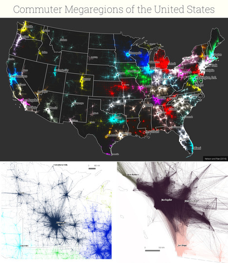

New maps use math to define the amorphous term.
Get Started for FREE
Sign up with Facebook Sign up with X
I don't have a Facebook or a X account


 Your new post is loading...
 Your new post is loading...
Your new post is loading...


PIRatE Lab's curator insight,
December 10, 2016 10:30 AM
Another example is the long line of defining the new geography.

Boris Limpopo's curator insight,
December 11, 2016 1:43 AM
Le macroregioni americane con i dati del pendolarismo

Tom Cockburn's curator insight,
December 13, 2016 3:53 AM
Plenty of space in the middle it seems
Sign up to comment
|
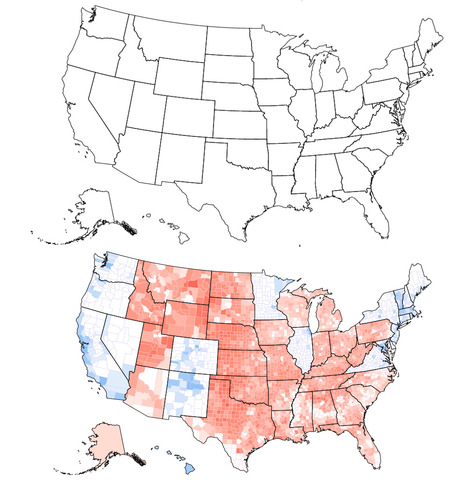
Can you tell what’s wrong with this map of the United States? I’ll give you a hint: Look near the Great Lakes and the Gulf of Mexico. Spot the problem yet? A further hint: Look at the border of Wisconsin and Illinois as well as the Florida Panhandle. See it now? The Wisconsin-Illinois border is slightly more southern and the Florida Panhandle is slightly shorter.

Corey Rogers's curator insight,
December 13, 2018 4:14 PM
The electoral college is such a mess that it shouldn't be relied on for figuring out the President. With the misrepresentation of the map and the continuous gerrymandering the United States should use the popular vote category instead of the Electoral College.
|


