

"Simulating climate conditions over the last 125,000 years and predicting how those changes would have allowed humans to spread around the globe, this video models human migration patterns." Read more: http://ow.ly/lWIp304qZEo
Via CT Blake
Get Started for FREE
Sign up with Facebook Sign up with X
I don't have a Facebook or a X account


 Your new post is loading...
 Your new post is loading...
Your new post is loading...
"Simulating climate conditions over the last 125,000 years and predicting how those changes would have allowed humans to spread around the globe, this video models human migration patterns." Read more: http://ow.ly/lWIp304qZEo Via CT Blake 
From
vimeo

"One Day on Earth is a unique global movement, community media creation platform, and collaborative film production engine. We invite you to join our international community of thousands of filmmakers, hundreds of schools, and dozens of non-profits, and contribute to this unique global project (with a map of all participants). Many future filming events will be announced in the coming year. One Day on Earth is a community that not only watches, but participates."
Tags: video, mapping, social media, place, culture.
"This video is from the BBC documentary film Earth: The Power Of The Planet. The clip is also embedded in this story map that tells the tale of Earth’s tectonic plates, their secret conspiracies, awe-inspiring exhibitions and subtle impacts on the maps and geospatial information we so often take for granted as unambiguous." Tags: physical, tectonics, disasters, mapping, geospatial, mapping, video, ESRI.

Rich Schultz's curator insight,
February 11, 2015 11:27 AM
Would an inverted Peters projection "freak you out"? 
Tiani Page's curator insight,
April 27, 2015 11:51 PM
As part of geography education we are required to teach students about different map projections and the rationale for these. This little video puts it quite well. 
Adelaide Parkin's comment,
September 7, 2016 8:52 PM
This is an engaging and funny clip! It is a great resource that could be used in a lessons introduction! for myself i love finding funny little clips that relate to a topic to play at the start of a lesson and then explain to the students what the topic is! Great resource i will be saving for later
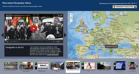
Professor Seth Dixon shares over 50 of his favorite geography videos in this online map http://bit.ly/KDY6C2

Melissa Marie Falco-Dargitz's curator insight,
November 3, 2014 12:02 PM
It was nice to see where everything was happening. I hope it gets updated to more current events. I wish we had something like this when we were looking at the invasion of Kuwait. 
Caroline Ivy's curator insight,
March 15, 2015 5:19 PM
Seth Dixon uses ArgGIS to juxtapose maps with the location a video is associated with.
This idea has crossed my mind before. Now, a video can be contemplated with the spatial accuracy needed. This connects events to a place, and can help students more fully grasp the geospatial distribution of events. 
Nita Ardi's curator insight,
January 14, 2019 12:16 PM
Great resource for classroom and information to get kids going.
|
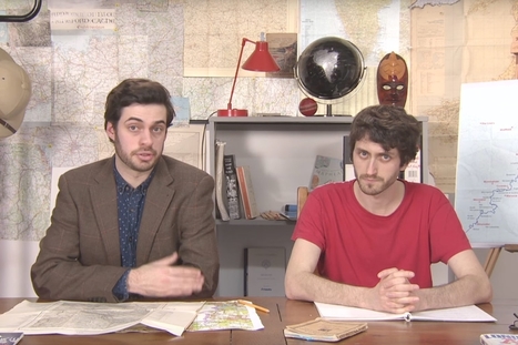
Mark Cooper-Jones and Jay Foreman, the Map Men, tap into a rich vein of geographical quirks to teach through comedy Via Mike Busarello's Digital Storybooks

Jeremy Hansen's curator insight,
August 29, 2016 12:43 PM
Holy heck these guys are good! I'd like to see more of these Map Men videos. I'm sure at least some of my 8th graders can appreciate some British wit.
Every 10 years, the Census Bureau calculates the exact center of the US population. Here's what that statistic shows about our history. Via Mike Busarello's Digital Storybooks
As stated in this NPR article: "The video shows satellite tracking of routes superimposed over Google Earth. It focuses on some of the main choke points for international shipping, such as the Strait of Malacca on the southern tip of Malaysia, Suez Canal, the Strait of Gibraltar and Panama Canal. It's a good reminder that about 90 percent of all the goods traded globally spend at least some of their transit time on a ship."
Tags: transportation, globalization, diffusion, industry, economic, mapping, video, visualization. Via Alexandra Piggott

Matt Davidson's curator insight,
February 26, 2015 4:52 AM
A great visual on shipping - Geographies of Interconnections (year 9) 
GTANSW & ACT's curator insight,
October 10, 2015 6:24 PM
An important aspect of global trade links and connections.

Alex Smiga's curator insight,
September 7, 2015 4:29 PM
Seth Dixon's insight:
This video covers various topics important to mapping and satellite imagery (and alesson from an APHG teacher on how to use this video with other resources). There is so much more to the world and space than what we can see see. Chromoscope, referenced in the video, simulates other forms of energy on the electromagnetic spectrum besides just visible light. This type of information is at the core of the science behind all of our satellite imagery. This video also covers many map projection issues and highlights online resources to understand map distortion including: Google’s Mercator Map PuzzleJason Davies’ interactive map projection websiteInteractive Gnomonic Projectionand the military's live rendering of what the Earth looks like right now. |


The World Economic Forum noted that some spatial research that was originally published in Nature, shows how geneticists took DNA samples from people of different cultures in different parts of the world to track their dispersal throughout the globe. The video uses climatic data, combined with the genetic data, to create a model showing how the human race spread across the globe over a 125,000 year period.
Tags: diffusion, demographics, mapping, migration, population, historical, video, visualization.