Human Interest
199.1K views | +5 today
Follow
Human Interest
Your new post is loading...
Scooped by Skuuppilehdet
Scoop.it!

These Maps Show How Vast New Infrastructure Is Bringing the World Together

These Maps Show How Vast New Infrastructure Is Bringing the World Together | Human Interest | Scoop.it

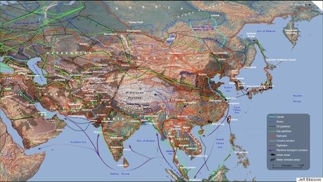
"If you want to understand the world of tomorrow, why not just look at a good map? For my (Parag Khanna) new book, Connectography, I researched every single significant cross-border infrastructure project linking countries together on every continent. I worked with the world’s leading cartography labs to literally map out what the future actually — physically — will look like.

It turns out that what most defines the emerging world is not fragmentation of countries but integration within regions. The same world that appears to be falling apart is actually coming together in much more concrete ways than today’s political maps suggest. Major world regions are forging dense infrastructural connectivity and reorienting their relations around supply chains rather than borders."


Tags: regionsmap.

No comment yet.
Scooped by Skuuppilehdet
Scoop.it!

Anyone who wants to be president needs to understand these 5 maps

Anyone who wants to be president needs to understand these 5 maps | Human Interest | Scoop.it
Parag Khanna argues that these five maps are critical to understand the world we live in.


Maps shape how we see the world.  But most of the maps hanging on our walls are dangerously incomplete because they emphasize political borders rather than functional connections.

David Stiger's curator insight, September 6, 2018 9:51 PM
It is highly doubtful President Trump read anything remotely similar to this piece. The maps fully embrace the brave new world of globalized trade, politics, and cooperation - something that is at odds with "America first" chants for isolation. China appears to be ready to take the lead in this new globalized order as it focuses on massive multi-continental infrastructure projects to increase its trading capabilities. It's also interesting to think of Canada as a greater potential partner than before because of all the various connections via transportation and communication. Canada could produce a majority of our food supply as climate change dries the world over. This article is clearly saying that geopolitical change is coming and that the leadership of the U.S. would be wise to have a plan. The only part of this article that raised eyebrows was the reorganization of the United States from 50 states to 7 regions with each region centered around a major city. Essentially it sounds like seven colossal states. The idea has potential but our adversaries, like Russia, also want to see the U.S. break apart into several regions; divide and conquer is a time tested strategy. 
Scooped by Skuuppilehdet
Scoop.it!

15 before-and-after images that show how we're transforming the planet

15 before-and-after images that show how we're transforming the planet | Human Interest | Scoop.it
We've dammed mighty rivers, built hundreds of artificial islands, and made the world's fourth-largest lake disappear.
Courtney Barrowman's curator insight, May 21, 2015 10:02 AM

Summer reading KQ2, How have humans altered Earth's environment? key concepts- remote sensing, land use

Gregory Stewart's curator insight, August 29, 2015 9:32 AM

Spatial Perspective!

Rescooped by Skuuppilehdet from AP HUMAN GEOGRAPHY DIGITAL STUDY: MIKE BUSARELLO
Scoop.it!

NatGeo Maps on Google

NatGeo Maps on Google | Human Interest | Scoop.it

The National Geographic Society has been inspiring people to care about the planet since 1888. National Geographic Maps publishes more than 100 new print maps annually and is a leading developer of digital map content found in websites and award-winning mobile apps. All proceeds from the sale and licensing of National Geographic maps go to support the Society's vital exploration, conservation, research and education programs. www.natgeomaps.com


Via Mike Busarello's Digital Storybooks
No comment yet.
Scooped by Skuuppilehdet
Scoop.it!

21 charts that explain how the US is changing

21 charts that explain how the US is changing | Human Interest | Scoop.it
The US is a big, complicated place that has undergone some big changes over its 238 years, and even in the last few decades. Here are 21 charts that explain what life is like today in the US — who we are, where we live, how we work, how we have fun, and how we relate to each other.


Tags: USA, map, map archives. 

Ms.Bright's curator insight, July 9, 2016 10:21 AM
Unit II
Michael Harding's curator insight, July 11, 2016 7:22 PM

A really challenging set of charts from the US. 


Rescooped by Skuuppilehdet from AP HUMAN GEOGRAPHY DIGITAL STUDY: MIKE BUSARELLO
Scoop.it!

4 Maps Crucial to Understanding Europe's Population Shift

4 Maps Crucial to Understanding Europe's Population Shift | Human Interest | Scoop.it
Despite economic growth in Central and Eastern Europe, the continent is still migrating to the Northwest.

Via Suvi Salo, Mike Busarello's Digital Storybooks
Sally Egan's curator insight, November 23, 2015 6:42 PM

These contemporary maps help undetrstand the changing global population distribution.

Adam Deneault's curator insight, December 7, 2015 4:53 PM

The two maps that received my attention the most was 'No Work for the Young' and "Big City Drain.' It bothers me to read that the young population of European citizens is out of work, even the cities that do well. Stockholm, a well off country has a you unemployment rate of 30 percent, and Sheffield is 35 percent, that is huge! As for Big City Drain, although Europe's cities are growing, it is because of immigrants from other countries and migrants from that country moving to another part, just to find better work. Having immigrants does not help a particular countries population. Also the fact that since big cities are more expensive, people will leave the big cities such as London and Paris to find cheaper means of living. 

Raymond Dolloff's curator insight, December 15, 2015 1:01 AM

Population shifts are an important part of determining migrating trends of a population. Are they going to more urban areas? Are they going to suburban areas?  These maps can help understand the questions regarding where the higher population trends are and what countries are seeing a drop in their population to people moving to new places and creating new lives.

Rescooped by Skuuppilehdet from Haak's APHG
Scoop.it!

38 maps that explain Europe

38 maps that explain Europe | Human Interest | Scoop.it
Europe, as both a place and a concept, has changed dramatically in its centuries of history.


Tags: Europe, map.


Via Dean Haakenson
Padriag John-David Mahoney's curator insight, February 19, 2015 3:17 PM

Despite the number of maps and figures, this is a really nice, condensed  broad stroke  of European history and politics, geography, and some economies. It's  also, for me, very entertaining.

Louis Mazza's curator insight, February 26, 2015 7:49 PM

Europe was once the most war torn nation, but is now known for its peace. This article’s introduction says that Europe has relative great prosperity but at the same time deep economic turmoil. I guess like everywhere else. This is a collection of 38 maps that show Europe in different stages of development to give the reader a better understanding. The first maps shows the countries that make up the EU. NATO’s growth is show in the second map from 1949 to 2009. Some maps show the unemployment rates, while others show who in Europe uses the Euro. Mine home country of Italy is shown in the lowest category of unemployment in the southern region. Other maps illustrate the histories of Europe starting in 117. AD. I think that this collection of maps is awesome for gathering knowledge on Europe. It sure is teaching me a lot.

Kristin Mandsager San Bento's curator insight, April 6, 2015 7:55 PM

At first this was overwhelming to digest.  But then I found it amazing in the fact that Europe could be explained in 38 maps!  The break down was very interesting.  I found it funny to see the breakdown of the richest in Europe.  This being based on finance, businesses, and real estate.  Nutella is definitely one of my favorites, but I had no clue the company was worth $27 billion.