


 Your new post is loading...

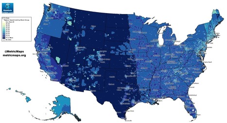

An unconventional look at American roads, mapped by their speed limits.
The above map, from MetricMaps, illustrates that abrupt division using local speed limit data. That map shows the maximum local speed limit for any local roads or highways in each Census block group in the U.S. The nationwide contrasts are striking, but so are the local ones: Zoom in to an individual city like Los Angeles, and the darker arteries effectively outline highways.


When looking at this map, before looking at the actual index of the colors that determine the speeds, I could already tell which areas would have a higher speed level and which ones had a lower speed level. Looking at the map, the mountain region had higher speed levels. I believe this is accurate because there isn't much going on in this areas. There is tons of land and direct roads that lead to other states. These states, like Wyoming or Montana, aren't really tourist attractions. In the New England area, one could see that the speed levels are lower and I would assume it would be because there are more people in this area. There is not a lot of land here for agriculture. I would say this map seems pretty accurate.
Speeding in America can lead to some people having road rage because they are in a hurry. However, by looking at the map of speed limits in the United States, the area that would probably see less cases of road rage is in the Central and Plains states that have a speed limit of over 75 miles per hour. This will also help reduce people who speed because they are in a rush to get from point a to point b. In areas such as Rhode Island, where the speed limits reach up to 65 miles per hour, people tend to rush and get angry with people who are going below the speed limit and lead to the need for speed to calm themselves down. Thus, it also includes a higher risk for getting a speeding ticket which will be expensive.