From
olihb
Get Started for FREE
Sign up with Facebook Sign up with X
I don't have a Facebook or a X account


|
Rescooped by
luiy
from Digital Delights - Images & Design
onto Public Datasets - Open Data - |

 Your new post is loading...
 Your new post is loading...
Your new post is loading...

Article rédigé par Delphine André, documentaliste multimédia à l’INA Alors que ré-ouvrent progressivement cinémas, théâtre, musées, galeries … et après plus d’une année de sociabilité culturelle contrainte, voire empêchée, cet article met e

This little book covers a large number of different ways of showing data. There are also some mathematical graphs, but the focus is on representations of data “from all areas of science and practice.” It’s a fascinating look into what was known in the early 1900s, and how people thought about graphical representations as tools. I’ve been interested in these historical books for a while, especially the lesser-known ones. Felix Auerbach (1856-1933) was a physicist with a broad set of interests (including the arts, his German wikipedia page has some more on that, as well as a portrait of him by Edvard Munch). He published a number of books in the 1910s and 1920s, on mathematics, physics (relativity theory in particular), and music.
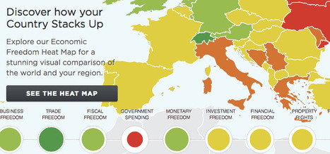
For much of human history, most individuals have lacked economic freedom and opportunity, condemning them to poverty and deprivation. Today, we live in the most prosperous time in human history. Poverty, sicknesses, and ignorance are receding throughout the world, due in large part to the advance of economic freedom. In 2017, the principles of economic freedom that have fueled this monumental progress are once again measured in the Index of Economic Freedom, an annual guide published by The Heritage Foundation, Washington's No. 1 think tank. For over twenty years the Index has delivered thoughtful analysis in a clear, friendly, and straight-forward format. With new resources for users and a website tailored for research and education, the Index of Economic Freedom is poised to help readers track over two decades of the advancement in economic freedom, prosperity, and opportunity and promote these ideas in their homes, schools, and communities. The Index covers 12 freedoms – from property rights to financial freedom – in 186 countries.

The third part in a series on the data science ecosystem looks at the applications that turn data into insights or models.
luiy's insight:
Open-source tools
Probably because this category has the most ongoing research, there is quite a rich collection of open-source modeling and insights tools. R is an essential tool for most data scientists and works both as a programming language and an interactive environment for exploring data. Octave is a free, open-source port of matlab that works very well. Julia is becoming increasingly popular for technical computing. Stanford has an NLP library that has tools for most standard language processing tasks. Scikit, a machine learning package for python, is becoming very powerful and has implementations of most standard modeling and machine learning algorithms. In the end, data application tools are what make data scientists incredibly valuable to any organization. They're the exact thing that allows a data scientist to make powerful suggestions, uncover hidden trends and provide tangible value. But these tools simply don't work unless you have good data and unless you enrich, blend and clean that data.
luiy's insight:
In the first three sections of the Twitter data collection tutorial, I demonstrated how to collect tweets using both R and Python and how to store these tweets first as JSON files then having R parse them into a .csv file. The .csv file works well, but tweets don’t always make good flat .csv files, since not every tweet contains the same fields or the same structure. Some of the data is well nested into the JSON object. It is possible to write a parser that has a field for each possible subfield, but this might take a while to write and will create a rather large .csv file or SQL database.

Éducation, économie, transports publics, etc. Visualisez facilement et partout en France plus de 50 jeux de données sur notre carte interactive. Nous voulons faciliter l’accès à l'open data Nous avons pour ambition de rendre accessible les données ouvertes au plus grand nombre via une interface simple de consultation. DataFrance s’inscrit dans le mouvement open data et veut contribuer à promouvoir une plus large ouverture des données dans l’intérêt de tout public.
luiy's insight:
Selection de données:
- Logement vacants à Paris - Accesibilité aux médecins généralistes en Gironde - Vols de voitures en France - Lycées par taux de reussite au bac à Marseille - Risque de séisme en France - Musées de France à Lyon

Cet article décrit le processus de publication des données de l'ensemble de la collection du Smithsonian American Art Museum (SAAM), soit 41000 objets et 8000 artistes, dans le web des données liées et ouvertes.
luiy's insight:
Modéliser, Lier, Vérifier :
Les musées, à travers le monde, ont construit des bases de données avec des méta-données sur des millions d’objets, leur histoire, les personnes qui les ont créés et les entités qui les représentent, mais ces données sont stockées dans des bases de données propriétaires et ne sont pas immédiatement utilisables. Récemment, les musées ont adopté le web sémantique dans l'intention de rendre ces données accessibles.
Parmi les projets notables du Linked Open Data, on peut citer The Europeana project qui a publié les données de 1500 musées, librairies et archives en Europe, le musée d'Amsterdam qui a publié les données de 73000 objets et le LODAC museum qui a publié les données de 114 musées au Japon.
Mais l’expérience a montré que publier les données des musées dans le web des données liées et ouvertes était difficile : les bases de données sont larges et complexes, l’information est très variée d’un musée à l’autre et il s’avère difficile de les relier à d’autres jeux de données.
luiy's insight:
Commons Transition: Policy Proposals for an Open Knowledge Society is our free downloadable e-book. Featuring the three newly updated Commons Transition plans by Michel Bauwens, John Restakis and George Dafermos in an easy to read format, the book is also complemented with special introductory material by Michel Bauwens and John Restakis and an exclusive interview with Commons Transition researcher Janice Figueiredo.

Quand Charles Darwin rencontre Larry Page Le premier arbre phylogénétique, tel qu'il apparaît en 1859 dans De l'origine des espèces au moyen de la sélection naturelle de Charles... "Dessine-moi un mouton", demandait le Petit Prince à l'aviateur. La représentation graphique a toujours été vecteur de connaissance, mais aujourd'hui, dans une culture qui abandonne peu à peu l'écrit pour l'image, elle devient une composante essentielle de la transmission du savoir. Un second défi se dresse : comment rendre compte de la masse d'informations disponibles pour décrire fidèlement la complexité du monde dans lequel nous évoluons, et notamment la diversité de la biosphère ? La conjugaison de ces deux ambitions a donné naissance au projet OneZoom (www.onezoom.org), un outil numérique qui permet de visualiser une version numérique de l'arbre de la vie. Une immersion dans la biodiversité, et une belle invitation à la curiosité. (...) - par Guillaume Frasca, La science infuse, 16/10/2012
Source : J. Rosindell et L.J. Harmon, OneZoom: A Fractal Explorer for the Tree of Life, PLoS Biology, 16 octobre 2012. Via Julien Hering, PhD
luiy's insight:
The authors introduce a new phylogenetic tree viewer that allows interactive display of large trees. The key concept of our solution is that all the data is on one page so that all the user has to do iszoom to reveal it—hence the name OneZoom (http://www.onezoom.org). Our interface is analogous to Google Earth, where one can smoothly zoom into any local landmark from a start page showing the whole globe, recognizing familiar landmarks at different scales along the way (e.g., continents, countries, regions, and towns). Equivalently, OneZoom can zoom smoothly to one tip of the tree of life—say, human beings—passing the familiar clades of animals, vertebrates, mammals, and primates at different scales along the way

The First Interactive Network Data Repository with Real-time Interactive Visualization and Analytics
luiy's insight:
Network Data Repository. Exploratory Analysis & Visualization.
A network and graph data repository containing hundreds of real-world networks and benchmark datasets. This large comprehensive collection of network graph data is useful for making significant research findings as well as benchmark data sets for machine learning and network science. All data sets are easily downloaded into a standard consistent format. We also have built a multi-level interactive graph analytics engine that allows for visualizing the structure of networks as well as many global graph statistics and local node level properties.
luiy's insight:
"Visualizing NYC's Open Data" [chriswhong.com] by self-proclaimed urbanist, map maker and data junkie Chris Wong provides a single view of the more than 1,100 open datasets made available by New York City.
The visualization of the "dataset of datasets" consists of a force-directed graph, of which the nodes are colored according to whether the according dataset is a table, chart, map, a file or a user-created view (colored blue).
The graph acts as an alternative portal to explore the available data, while demonstrating its scale and diversity.
luiy's insight:
Teaching material
Slides for Chapters 1-5 of the 3rd edition can be found here. Slides for Chapters 6-8 of the 3rd edition can be found here
These archives contain .pdf files as well as .odp files in Open Document Format that were generated using OpenOffice 2.0. Note that there are several free office programs now that can read .odp files. There is also a plug-in for Word made by Sun for reading this format. Corresponding information is on this Wikipedia page.

Google open sourced a new package for the R statistical computing software that’s designed to help users infer whether a particular action really did cause subsequent activity. Google has been using the tool, called CausalImpact, to measure AdWords campaigns but it has broader appeal. Via Dominique Cardon
luiy's insight:
Google announced on Tuesday a new open source tool that can help data analysts decide if changes to products or policies resulted in measurable change, or if the change would have happened anyway. The tool, called CausalImpact, is a package for the R statistical computing software, and Google details it in a blog post.
According to blog post author Kay H. Brodersen, Google uses the tool — created it, in fact — primarily for quantifying the effectiveness of AdWords campaigns. However, he noted, the same method could be used to gauge everything from whether adding a new feature caused an increase in app downloads to questions involving events in medical, social or political science.
http://google.github.io/CausalImpact/
|
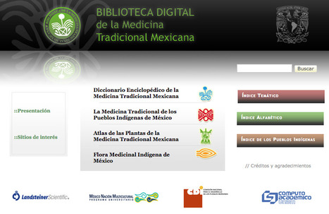
La medicina tradicional es reconocida hoy como un recurso fundamental para la salud de millones de seres humanos, un componente esencial del patrimonio tangible e intangible de las culturas del mundo, un acervo de información, recursos y prácticas para el desarrollo y el bienestar, y un factor de identidad de numerosos pueblos del planeta. La medicina tradicional mexicana, como toda institución social, ha cambiado en el curso de los siglos, interactuando con otros modelos terapéuticos para conformar lo que llamamos el “sistema real de salud” de millones de mexicanos del siglo XXI, habitantes del campo y la ciudad. Asociada fuertemente a las plantas medicinales –su recurso más abundante, accesible y conocido-, la medicina tradicional es mucho más que botánica medicinal, y esta obra que hacemos pública hoy trata, precisamente, de dar cuenta de su riqueza y diversidad. Tomando como base la información contenida en la Biblioteca de la Medicina Tradicional Mexicana que elaboramos en el Instituto Nacional Indigenista (INI) entre los años 1990 y 1994, la Universidad Nacional Autónoma de México decidió preparar una nueva versión, recurriendo a las posibilidades y ventajas que ofrecen las Tecnologías de la Información y Comunicaciones: se trata, en consecuencia, de una Biblioteca Digital de la Medicina Tradicional Mexicana. La posibilidad de consulta y recorrido interactivos enriquecen a la versión impresa, la ponen a salvo de mutilaciones y alteraciones, y ofrecen al lector una cómoda y funcional labor de interacción de nombres, conceptos, pueblos, enfermedades y recursos materiales y simbólicos.
luiy's insight:
Since the release of Mining the Social Web, 2E in late October of last year, I have mostly focused on creating supplemental content that focused on Twitter data. This seemed like a natural starting point given that the first chapter of the book is a gentle introduction to data mining with Twitter’s API coupled with the inherent openness of accessing and analyzing Twitter data (in comparison to other data sources that are a little more restrictive.) Twitter’s IPO late last year also focused the spotlight a bit on Twitter, which provided some good opportunities to opine on Twitter’s underlying data model that can be interpreted as an interest graph.
luiy's insight:
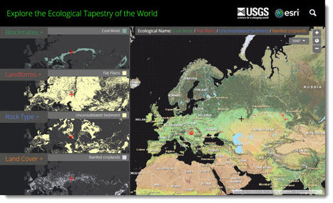
This map as well as the data layers used to create it can be explored in a new story map that introduces ecological land units. The data is available in the form of services and can enrich any GIS effort.
The collaborative partnership between Esri and USGS resulted in a dynamic online map representing the world’s ecological diversity at unprecedented detail and authority. This work leveraged quantitative methods, geographic science, and big data produced by government agencies and the scientific community. To create this map the data were processed in Esri’s ArcGIS cloud computing environment. This map provides new knowledge and understanding of geographic patterns and relationships by distinguishing the geography of the planets’ ecosystems. - See more at: http://blogs.esri.com/esri/esri-insider/2014/12/09/the-first-detailed-ecological-land-unitsmap-in-the-world/#sthash.Fm99R5lg.dpuf

Code4SA's Adi Eyal takes a look at Africa's first open data city.
luiy's insight:
... the City chose to build their portal in-house rather than using one of the existing platforms. The UK open data portal for instance uses an open source platform CKAN. A commercial offering called Socrata is also available if you feel like you need the security of using a closed source solution. The benefit of using an existing platform is that you’re benefiting from the wisdom of those who came before you. It is also often much cheaper than doing it on your own. Our own modest data portal uses Socrata. As a developer, for me the killer feature here is that every dataset comes packaged with a pre-built API and documentation. It also allows non-technical users to create graphs and maps without having to download the data and opening up the spreadsheets. The City’s website in contrast, is not much more than a collection of links.

De nouvelles révélations d'Edward Snowden mettent en lumière les agissement des pays de l'Otan en Afghanistan et le décryptage de données par la NSA américaine.
luiy's insight:
(De Hambourg) C’était un passage attendu du 31c3, le 31ème Chaos Communication Congress qui se déroule en ce moment à Hambourg : dimanche soir, devant 3 500 personnes, la journaliste Laura Poitras et le hacker Jacob Appelbaum ont révélé des documents d’Edward Snowden jusque-là inconnus du public.
Simultanément, plusieurs articles contenant plusieurs dizaines de ces documents ont été publiés (en anglais et en allemand) sur le site de l’hebdomadaire allemand Der Spiegel.
Des révélations touchant à des domaines très variés, allant de la guerre en Afghanistan aux capacités qu’a la NSA de décrypter les données circulant sur le Web.
http://www.spiegel.de/media/media-35508.pdf
luiy's insight:
TubeKit is a toolkit for creating YouTube crawlers. It allows one to build one's own crawler that can crawl YouTube based on a set of seed queries and collect up to 16 different attributes.
TubeKit assists in all the phases of this process starting database creation to finally giving access to the collected data with browsing and searching interfaces. In addition to creating crawlers, TubeKit also provides several tools to collect a variety of data from YouTube, including video details and user profiles
luiy's insight:
Project Big Data is an interactive tool which enables you to visualize and explore the funding patterns of over 600 companies in the Big Data ecosystem! It is based on the work I did for Project C (which you see and can read about here). The list of companies and their classification into categories is based on a dozen published sources and rough text analytics of the Crunchbase database. Crunchbase is a curated crowed sourced database of over 285k companies.
As for the data, there are 645 public & private companies in the data set. From Teradata and IBM to Actuate & Zoomdata. I began by harvesting data from Crunchbase by using their free API w/ Python. As of September, Crunchbase had 1250 funding events for 410 of the companies on my list. I've grouped these companies into 18 categories, allowing you to compare peers as well as trends across categories. Some of the categories are broken down further. For example, the tool allows you to differentiate between cloud-based and on premise solutions or SQL vs. NoSQL databases. I gathered additional data from a variety of sources. For example, LinkedIn was used to find the number of employees.
OPENACCESS Workbook: Project Big Data v1.0 https://public.tableausoftware.com/download/workbooks/ProjectBigDatav1_0?format=html
luiy's insight:
Preface and Table of Content Chapter 1. Data Mining Chapter 2. Map-Reduce and the New Software Stack Chapter 3. Finding Similar Items Chapter 4. Mining Data Streams Chapter 5. Link Analysis Chapter 6. Frequent Itemsets Chapter 7. Clustering Chapter 8. Advertising on the Web Chapter 9. Recommendation Systems Chapter 10. Mining Social-Network Graphs Chapter 11. Dimensionality Reduction Chapter 12. Large-Scale Machine Learning
Download Full Book : http://infolab.stanford.edu/~ullman/mmds/book.pdf

ukituki's curator insight,
August 28, 2014 6:22 PM
The book is based on Stanford Computer Science course CS246: Mining Massive Datasets (and CS345A: Data Mining).
luiy's insight:
Brightpoint Consulting recently released a small collection of interactive visualizations based on open, publicly available data from the US government. Characterized by a rather organic graphic design style and color palette, each visualization makes a socially and politically relevant dataset easily accessible.
luiy's insight:
Data
Our database contains over 30 million metadata records linking to millions of openly licensed media objects - books, photos, art, artefacts, audio clips and more. We'll be featuring some of our very best content here.
Europeana Labs combines rights-cleared images, videos, audio and text files with technical expertise, tools, services and business knowledge.
|


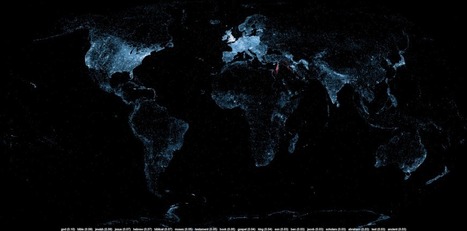
A large number of Wikipedia articles are geocoded. This means that when an article pertains to a location, its latitude and longitude are linked to the article. As you can imagine, this can be useful to generate insightful and eye-catching infographics. A while ago, a team at Oxford built this magnificent tool to illustrate the language boundaries in Wikipedia articles. This led me to wonder if it would be possible to extract the different topics in Wikipedia.
This is exactly what I managed to do in the past few days. I downloaded all of Wikipedia, extracted 300 different topics using a powerful clustering algorithm, projected all the geocoded articles on a map and highlighted the different clusters (or topics) in red. The results were much more interesting than I thought. For example, the map on the left shows all the articles related to mountains, peaks, summits, etc. in red on a blue base map. The highlighted articles from this topic match the main mountain ranges exactly.
Read on for more details, pretty pictures and slideshows.
A bit about the processYou can skip this section if you don’t really care about the nitty-gritty of the production of the maps. Scroll down to get to the slideshows.
Getting the dataTrains, stations, platforms, railways, etc.
The first the step to create these map was to retrieve all Wikipedia articles. There are 1.5 million of them and only a portion (400,000) are geocoded, but this doesn’t matter, because it’s an all or nothing deal: everything must be downloaded. I had to download the raw data from this page. It’s quite a large download at 9GB compressed and it expands to about 40GB once it is uncompressed. I then parsed this very large file to extract the article content, links and geographical coordinates.
Identifying topicsIslands, coasts, beaches, oceans, etc.
To extract topics from this huge corpus, I used Latent Dirichlet Allocation. This algorithm can extract a given number of topics from a large corpus. Usually the optimal number of topics can be inferred from the likelihood values over several topic runs. However, in this case, since the corpus is very large and each run is very time consuming (50 hours on the most powerful AWS cluster instance), I chose a number relying on an educated guess and my LDA experience.
I ran the LDA algorithm using Yahoo’s LDA implementation since it’s quite fast and can be parallelized. After 50 hours, I got 300 different topics linked to 1.5 million articles, but because only 400,000 of them are geocoded, the rest of this post only pertains to these 400,000. You can download the topic descriptions here. The topics are very varied and range from geographical regions, ethnic groups, science, sports (including both kinds of football!), historical sites and even archeological dig sites.