
Explore the asteroids (3D Simulation): http://www.asterank.com/3d/
Get Started for FREE
Sign up with Facebook Sign up with X
I don't have a Facebook or a X account


 Your new post is loading...
 Your new post is loading...
Your new post is loading...
Explore the asteroids (3D Simulation): http://www.asterank.com/3d/ 
No comment yet.
Sign up to comment

This one's for you Game of Thrones fans and aficionados. Jerome Cukier visualized groups of people, from Lannisters to Starks, and kills throughout the books. Each circle represents a character and is sized by number of appearances. Color represents status, and connecting lines are killer-killee relationships (aw, so sweet). The best part is that this all plays out over time.
Sakis Koukouvis's insight:
Game of Thrones' Circles
This visualization shows the moon's phase and libration throughout the year 2013, at hourly intervals. Each frame represents one hour. In addition, this visualization also shows other relevant information, including moon orbit position, subearth and subsolar points, distance from the Earth. Click each graphic to learn more about what it means! Finally, to learn more about this visualization, or to see what the moon will look like at any hour in 2013, visit http://svs.gsfc.nasa.gov/goto?4000!
|

|
Scooped by Sakis Koukouvis |


|
|
Rescooped by Sakis Koukouvis from Polymath Online |
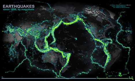
This map of all the world's recorded earthquakes between 1898 and 2003 is stunning. As you might expect, it also creates a brilliant outline of the plates of the Earth's crust—especially the infamous "Ring of Fire" around the Pacific Plate.
The plate boundaries are amazingly vivid in this geovisualization of the all the earthquakes over a 105 year span. How did scientist orginally come up with the theory of plate tectonics? How did spatial thinking and mapping play a role in that scientific endeavor?
|
|
Scooped by Sakis Koukouvis |

The Mechanical Organism is a live visual music performance. It is made from interpretations of music that are modeled in 3d and animated to the rhythm. The music and animation are controlled live at the same time with a midi controller.
|
|
Scooped by Sakis Koukouvis |
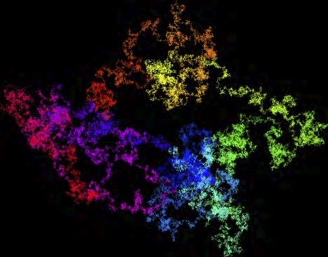
Of course, the number of digits in π is infinite, but over the years, as computers have become more powerful, we know many more of them than ever before. But it’s one thing to say that I can download trillions of digits of π and another to make some sort of sense out of all of these digits. Into this steps a team of researchers from Australia, Lawrence Berkeley National Laboratory, and Simon Fraser University with some elegant visualizations of π. In a recent paper, they used a classic method of visualizing large strings of numbers: the random walk.
More on "Pi": http://www.scoop.it/t/science-news?tag=pi
|
|
Scooped by Sakis Koukouvis |
A simulation showing ground wave action as shock waves travel under the ocean, passing Catalina Island (in blue, upper right). View from underground level, looking south.
|
|
Rescooped by Sakis Koukouvis from Urbanism 3.0 |
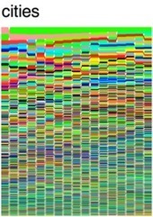
We are an increasingly urban species, with more than half of humanity living in urban hubs. Ranking the world's 590 most-populous cities, this psychedelic stack flow packs history, geography, and population into a single digital square.
|
|
Scooped by Sakis Koukouvis |
In this new RSA Animate, Manuel Lima, senior UX design lead at Microsoft Bing, explores the power of network visualisation to help navigate our complex modern world. Taken from a lecture given by Manuel Lima as part of the RSA's free public events programme.
|
|
Scooped by Sakis Koukouvis |
Exo is a visualization tool for exploring the nearly 2,300 exoplanet candidates that have been so far identified by NASA's Kepler mission.
http://www.fastcodesign.com/1669702/explore-the-galaxy-using-the-actual-minority-report-interface
Articles about EXOPLANETS: http://www.scoop.it/t/science-news?tag=exoplanets
|
|
Scooped by Sakis Koukouvis |
|
|
Scooped by Sakis Koukouvis |
|
|
Scooped by Sakis Koukouvis |
A supercomputer at NASA's Goddard Space Flight Center was used to map aerosols - particles suspended in the air - based on observations from August 2006 - April 2007. The result is surprisingly lovely. I've marked a couple of pints you want to pay attention to, like a volcanic eruption near Madagascar; the effect of the event is stunning.
|
|
Scooped by Sakis Koukouvis |

An interactive 3D visualization of the stellar neighborhood, including over 100,000 nearby stars. Created for the Google Chrome web browser.
|
|
Scooped by Sakis Koukouvis |
This is a series of videos that visualizes a single piece of content being shared between hundreds of thousands of individuals on Facebook. We've tried to capture the frenetic energy surrounding three of the most shared images. Each visualization is made up of a series of branches starting from a single person. As the branch grows, re-shares split off on their own arcs, sometimes spawning a new generation of re-shares, sometimes exploding in a short-lived burst of activity. The two different colors show gender, and each successive generation becomes more and more white as time goes by.
|
|
Scooped by Sakis Koukouvis |
‘Insect traps’ explores the digital nature of organic molecules and biological organisms. Virtual insects are injected in closed simulated environments where they fight for their lives against larger than life biomolecular structures.
|
|
Scooped by Sakis Koukouvis |
This video illustrates the creation of memory threads. A simulated P2P network is generated where each peer contains digital memories.
|
|
Scooped by Sakis Koukouvis |
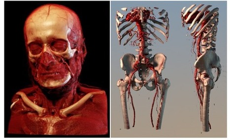
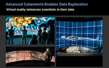
Medicine has been revolutionised by 3D imaging techniques. But you ain't seen nothing yet, say data imaging researchers
|
|
Scooped by Sakis Koukouvis |
This visualization tours the ocean floor from the gentle continental slopes to the deepest trenches using data analyzed and archived by NOAA. Does it look familiar? It is actually the same data that Google has incorporated into Google Earth and Ocean.
|
|
Scooped by Sakis Koukouvis |
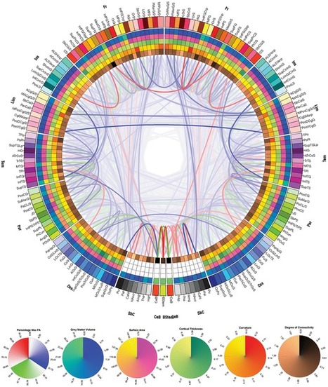
The point is to show how advances in imaging and data visualization technologies enable inter-disciplinary research which just a decade ago would have been impossible to conduct. There is also a somewhat artistic quality to these images, which reinforces the notion of data visualization being both art and science.
CONNECTOME: http://www.scoop.it/t/science-news?tag=connectome
|
|
Rescooped by Sakis Koukouvis from Educational technology |
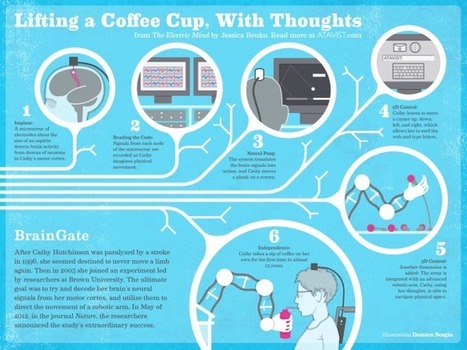
Brain implants, a robotic arm, thought control — it sounds far out. But in Brown University’s BrainGate experiment, the combination work...
More on ROBOTICS: http://www.scoop.it/t/science-news?tag=robotics


Those big chunks of bare rock hurtling around the asteroid belt? They might be worth something. An interactive roadmap shows how to cash in.
http://www.popsci.com/science/article/2012-12/asterank-3d-visual-guide-getting-rich-space