:: The 4th Era ::
139.8K views | +0 today
Follow
:: The 4th Era ::
Impact of the internet age on human culture and K-20 education policy/administration
Curated by Jim Lerman
Your new post is loading...
Rescooped by Jim Lerman from visual data
Scoop.it!

Favorite Pew Research Center data visualizations from 2014

Favorite Pew Research Center data visualizations from 2014 | :: The 4th Era :: | Scoop.it

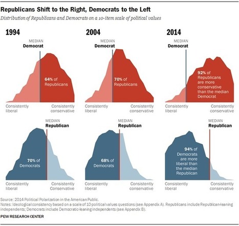
"The heart of our work at the Pew Research Center is data. And data visualizations that tell clear stories about our research — whether it be about American politics or our changing demographics — are just as important as the words we write in a report. So, what makes a successful data visual? We think it should present information clearly and concisely, engage the reader and allow them to explore that information.

This year, the design staff looked back through our 2014 archive, and these graphics stood out as almost universal favorites. These visualizations presented a particular challenge and, for each of them, we talk about the approach we took in presenting the data."


Via Lauren Moss
No comment yet.
Rescooped by Jim Lerman from visual data
Scoop.it!

The 16 Most Compelling Infographics Of 2012

The 16 Most Compelling Infographics Of 2012 | :: The 4th Era :: | Scoop.it

2012 might be the year which we reached 'peak infographic'.

You can’t have an issue or a piece of data without putting it into a picture so it’s easier for people to understand. While this has mostly resulted in a glut of ugly graphics that don’t actually do anything with data (and you’ll see some of these below), it’s still an incredibly simple way to get information to you fast. And this year, some of our most compelling content has appeared in the format.

These are some of our favorites.


Via Lauren Moss
Lauren Moss's curator insight, December 21, 2012 5:40 PM

A curated infographic gallery from FastCompany...

Jean-Michel Bayle's curator insight, December 29, 2012 11:49 AM

A voir ... rapidement